Representing information in a visual manner through the use of maps is one of the biggest subsection of data visualization types. From planning a trip, to measuring a company’s sales performance in different regions, maps allow a visual representation which communicates information quickly and adds a special dimension to the data.
When you say Nicholas Felton, you say data visualization, performance, creativity and passion. Felton is an infographic designer, mostly known for his activity as part of Facebook’s product design team, as well as for his Personal Annual Reports. The latter compile daily measurements into graphs, maps and statistics, mirroring the year’s activities, from food and drinks to travels, communication and relationships.
Humans are highly visual creatures. This allows for a higher understanding of data and enables managers, for example, to make quicker, smarter decisions. Looking back thousands of years, cavemen used visuals to, for instance, track time, record celebrations and other such activities.
There is no doubt that effective data visualization shifts the balance between perception and cognition. It determines the use of the visual cortex at a higher capacity and the viewer understands the presented information much better and quicker and is able to make a better decision based on these findings.
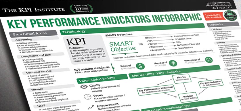
As the benefits of performance measurement and management become broadly known, more and more organizations have implemented frameworks that includes more than the traditional lagging measures of their financial and operational performance. But squeezing a great deal of information into a small amount of space and also designing it to result in a visual display that is easily and immediately understandable by the viewer can prove to be very challenging.