Choosing the right map type to communicate information

Representing information in a visual manner through the use of maps is one of the biggest subsection of data visualization types. From planning a trip, to measuring a company’s sales performance in different regions, maps allow a visual representation which communicates information quickly and adds a special dimension to the data.
There are several map types, each with its strengths and weaknesses. These can be combined or altered to make new types of maps available or to diminish their flaws by adding value to the displayed information.
The most commonly used map types are:
- Choropleth maps
- Isopleth maps or heat maps
- Proportional symbol maps
- Pinpoint maps
- Connection maps
- Subway maps
- Choropleth is the most widespread type of map. The name comes from two Greek words that signify area or region and multitude. Also, the name suggests a reference to color, which is the main aspect of this map type. In its visual representation, a color scale is allocated to categorical or numerical data and each region is colored according to the data value. This type of map generally uses political boundaries as regional delimitations. When used correctly, this map presents information in a clear and easy to understand manner.
The below example represents the doctors’ pay level in America. The values can go in two directions: from the average which is the middle, either towards higher or towards lower. Both of these directions have five different hues. Some choropleth maps offer additional information by providing an interval for each of the different color hues.

- Isopleth maps are most commonly used for weather forecasts but they can also be radar maps, temperature maps or rainfall maps. The term “isopleth” means range of quantity. It shows the gradual change over space but lacks sudden changes of border lines such as the ones in choropleth maps. The main disadvantage of this map type is that it requires a large amount of data for an accurate reporting.
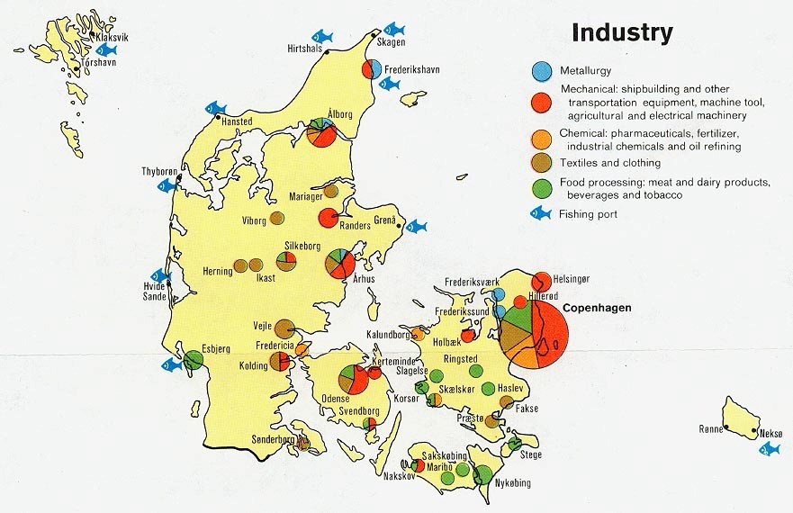
- Proportional symbol maps use circles or some other simple shape centered on each region of interest. The shape differs in size according to the quantitative data. A very common visual representation of this map type is to use pie charts in place of the shape in order to add more data to a single map.
The following example reflects industries from Denmark as they were in 1974. Their proportions are expressed in each region as part of a pie chart.
- Pinpoint maps show the exact location of certain things on a map. These have been increasing in popularity as more data sources are able to include exact location. Furthermore, as mobile devices continue to include more advanced GPS tracking options, pinpointing a certain person’s location is becoming much easier. Twitter posts and Facebook check-ins are commonly mapped this way. Another version of this map is represented by searchable maps, like Google maps, that show the exact location of the items you searched for.
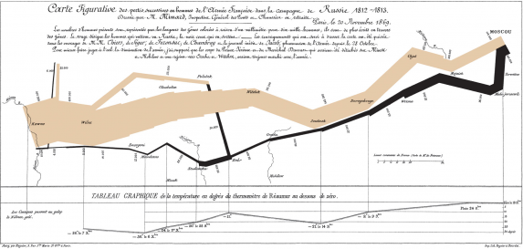
- Connection maps are similar to the pinpoint maps but they have a small addition. Each point on the map is connected to the next. In many examples of this map type, the connections are abstract (like tweet replies of Facebook connections), and the connection lines are represented either with a straight or a curved line. These types of maps are, in essence, graphs or network data that has been drawn with a geo-spatial layout.
The famous map of Napoleon’s march by Charles Joseph Minard is a version of a connection map with a quantitative dimension added. In this visual representation, the thickness of the connecting lines represents the size of each army at each geographical position.
- Subway maps are a widespread and largely available version of the connection maps. The important aspect in this map type is the connection point and a lower accent is given to the exact geographical placement of that point. They are created by designers that simplify the routes of metros or subways to simple lines at different angles. This simplified visual representation increases the maps legibility and emphasizes the really important information: the stop name, desired destination and the route train/bus/metro take.
References:
- The world bank group (n.d.), Data visualization tools
- Few, S. (2009), Introduction to Geographical Data Visualization
- McGhee, G. (2011), Getting started with data visualization
Image sources:
- The Economist (2015), What’s up, doc?
- Clipart-Finder (2014), Denmark industry 1974 clipart
- Tufte, E. (n.d.), Napoleon’s march
- Stock Snap

Tags: Data Visualization