How do you choose the right chart or graph to tell your story?
There is no doubt that effective data visualization shifts the balance between perception and cognition. It determines the use of the visual cortex at a higher capacity and the viewer understands the presented information much better and quicker and is able to make a better decision based on these findings.
Visual representation is one of the best methods to understand background data sets. Key messages are quickly placed in focus with the use of a visual reresentation. Presenting information in a visual manner makes it possible to discover answers to pre-set questions, or to identify new questions requiring answers, or hidden and surprising patterns and observations that wouldn’t be apparent from viewing at statistical data alone.
These are the two broad goals that data visualization follows: explanatory and exploratory. In the case of explanatory visualization, the viewer is taken along a pre-defined path as the user already has a question in his mind that needs answering, and after viewing the visual representation of the data, he identifies an answer. Thus, the visualization tells him a story. In the case of an exploratory visualization the viewer is presented with many dimensions to a set of data and he can benchmark between multiple sets of data. Thus, more time is required for the viewer to first familiarize himself with the visual representation, to then identify an area of interest to him, and then explore the visual representation from different dimensions. Thus, the user of the visual representation identifies by himself the story that the visualization is transmitting.
Both the collected data and the questions the viewer initially has can be connected by creating a chart of graph. However, when transmitting information in a visual manner there are a multitude of ways to facilitate the story-telling of that information, to bring the data to life and give it meaning. Choosing the right chart or graph for the type of data at hand, among this multitude of communication possibilities, to aid in offering the answers to the viewers questions can prove to be problematic.
Below, you can find some of the most commonly used charts and graphs, as well as some of their benefits and drawbacks, in order to better understand them and be able to use these visuals both more efficiently and depending on the audiences’ pre-identified needs. These include bar charts, line charts, pie charts, Gantt charts, bullet charts, scatter plots, bubble charts and maps.
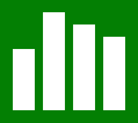 Bar charts are the most commonly used visual representations of data. The reason behind this is quite simple, they are very easy to use, they provide an easy comparison of different data sets by showing highs and lows at a glance. Recommended is that one should add several bar charts to be displayed on a dashboard as they aid the user to quickly compare information and also the light use of colours to increase the impact on the data.
 Line charts are also very broadly used. They connect through a line individual data points. The resulted visual representation is a very simple and straightforward visualization of a sequence of values. Recommended is that one should use a combination of bar charts with line charts as to provide a more simple and clearer comparison between various types of data. Also one should consider to fill the space above or below, in case some is remaining, with a set of lines with appropriate information or data values, choosing to either add all the values or just the lowest and highest ones.
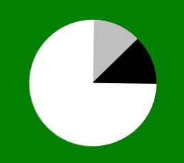 Pie charts should only be used to show relative proportions. The fact that it clearly indicates a part-to-whole relationship between the values is the primary strength of a pie chart. They encode values excessively by using three visual attributes: the surface of each slice, the formed angle by each slice and the length of each piece along the perimeter of the pie. Even when all the mentioned elements are properly calculated, the downside is the inability to precisely perceive any of these attributes. The humans visual perception is not evolved enough to support correctly decoding of distance along a curve, areas or angles. Recommended is that one should limit the slices of a pie chart to six maximum and always show the value corresponding to each slice. Pie charts are not recommended when benchmarking many pieces of information with relatively similar values.
 Gantt charts are most commonly used in project planning as they are the best at displaying the start and finish point of a project and the relevant dates along the way. Gantt charts provide a basic and clear visual representation of what is expected to happen, the tasks deadline and the person responsible to ensure the successful completion of the task. Recommended is that one should use a Gantt chart in combination with various chart types that allow data filtering and information drill down to enlarge the provided insights. Also adding colour to certain elements within the Gantt chart informs viewers about key aspects of the project.
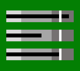 Bullet charts allow viewers to keep track of their progress with a specific goal in mind. At its core, a bullet chart is simply a deviation of a bar chart. Thus, it illustrates the performance of a key performance indicator against a goal. Bullet charts also provides visual sufficiency, as it offers the viewer with a graphical display of the thresholds. Recommended is that one should take into consideration the threshold colors which can be either red, yellow and green or simply different shades of grey. The use of grey variations will remove the feeling of a rainbow full color dashboard.
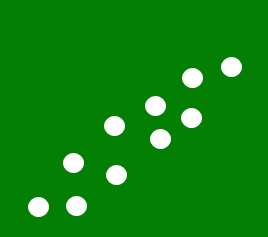 Scatter plots are an effective visualization to present trends, concentrations and also outlines, which will determine the viewer to focus on areas where more investigation efforts are required of him. These types of visualizations are commonly used to identify relationships between information which are not clearly visible when viewed in a table. Recommended is that one should take into consideration the fact that scatter plots are mostly effective with two dimensional information. Another recommendation is to provide a trend line that provides a clearer correlation between different data points. By adding filters the viewer is given the opportunity to drill down into various views and details of the visualization which allows him to quickly find patterns in the data points.
 Bubble charts are similar visual representations as scatter plots. However, bubble charts provide more dimensions of information by variation of size (or also color or texture and so on) of the data points. Therefore, bubble charts can display more dimensions of data points in a two dimensional visualization. Recommended is that bubble charts be used to display concentration of data points along two axes by varying the size and color of data. Therefore, a bubble chart can be a good visual representation that will provide answers to many questions that the viewer might have.
 Maps are visual representations used when the information is related to a particular location (this can be, for example, a city, area or country). The advantage of these visual representations is that their representation directly correlates to a situation in the real-world. Recommended is that one should the into consideration the various types of map visualizations available, such as choropleth maps, proportional symbol maps, cartograms, pinpoint maps, subway maps, connection maps, prism maps, isopleth maps and stream plots. Filters for various types of charts, tables, or graphs can be provided in the form of a map.
The presented visualization above are just a small number of visual representation which are some of the most popularly used. Each of them have may different advantages. There are also existing patterns viewers can use to create good and efficient visualizations. Moreover, the general public is already familiarized with these visual representation and can easily identify the story behind the data and thus the information is very accessible and understandable for them.
References:
- Laumans, J., (n.d.), An introduction to visualizing data
- Stodder, D., (2013), Data visualization and discovery for better business decisions
- Juice Analytics, (2009), A guide to creating dashboards people love to use

Tags: Data Visualization