Which are the best practices in designing infographics?
Humans are highly visual creatures. This allows for a higher understanding of data and enables managers, for example, to make quicker, smarter decisions. Looking back thousands of years, cavemen used visuals to, for instance, track time, record celebrations and other such activities.
With the passing of time, civilizations have created hieroglyphics and symbols such as letters and numbers to better organize and facilitate communication. Some visuals help bridge cultural differences. For example, they come to the aid of travelers, on any continent, assisting them in easily identifying pharmacies, hospitals, restrooms and so on.
An infographic is a visual representation of information or data with the use of charts, diagrams, colors and other visual means. They can be highly useful, even beautiful, but only when the story transmitted is well represented. We are currently in a vast sea of information and people are striving to transmit as much information, in the quickest and most condensed manner possible.
When designing infographics, one should consider some guidelines and design recommendations for structure and form, content, color and visual elements. These guidelines enable the infographic’s creator to better transmit his story and allow the user to better understand the data presented:
- Make it visual
The first golden rule of infographics is to show the data and not tell it. The foundation of any good infographic is data visualization. Regardless whether the information was collected or received, the infographic creator is responsible for turning the information into a visually stimulating, cohesive design that tells the story and does not miss any opportunity to visualize the data.
- Simplify
The best use of an infographic is to explain complex ideas by reducing them, down to their simplest form. The visuals used should show trends and demonstrate the relationships between data by using easily understandable visual elements. These should be designed in a way that, as mentioned above, bridges gaps between cultures and thus are recognizable and understood by people around the globe. Also, any elements that do not directly contribute to the understanding of the story should be eliminated.
- Logics
As Arabic people, for instance, read from right to left, an infographic should follow a logical flow of information, as they are not simply information plus graphics, spread randomly on a piece of paper. Instead, the design of an infographic is a narrative process that involves representation and interpretation to develop and convey an idea. Effective infographic design should primarily focus on visual elements and structure, instead of text, to convey the story told and the messages transmitted. The visual elements used in an infographic should not be of a decorative nature, but rather used to visually communicate vital content, drafted out of the transmitted story. It is thus suggested to allocate considerable time on the design and evaluation of the visual elements created, to ensure they accurately convey the original message to the targeted audience.
- Keep it concise
The amount of information designated to be transposed should not influence the size of the end resulted infographic. An effective infographic should stick to the equivalent of 1-2 pages, they are not multi-page handouts or brochures.
All elements of an effective infographic should be inter-related, should contribute to the delivery of the message and should have clear title, focus and purpose.
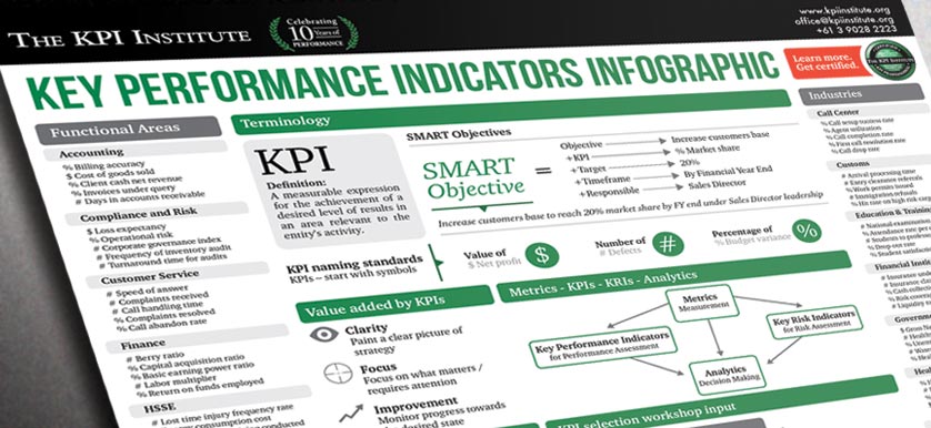
Image Source: