5 common mistakes in dashboard design

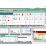
Dashboards are visual representations of the company’s performance. As an operational tool, it illustrates the most relevant information for decision making. Their core objective is to consolidate on a single screen the most important KPIs, in order to monitor data at a glance.
Dashboards lead organizations to a more efficient management of their business, helping them optimize the progress in reaching targets. To do so, dashboards should ensure efficient data communication and avoid the following common mistakes.
1. Poorly designed charts and graphs
Smart visual representations can facilitate data analysis. It is recommended to avoid 3D charts, as they make it harder to estimate the levels of each data series. Pie charts are not the best choice either, as it is hard to see how individual items relate to one another and with the whole.
The most popular visual representations are the bar charts, as they provide clear levels for each item and they allow comparisons to be easily made.
Another important aspect in designing charts is to make sure the scale starts from zero. Otherwise, results can be distorted.
2. Inefficient data presentation
Data should be expressed directly and in a relevant format, to ensure the meaning behind the numbers is easy to spot. For example, to monitor the budget’s evolution, the data should be presented in percentages to reflect the variation from one period to another, instead of providing sums. Percentages ensure better and fast understanding of data.
The purpose of the dashboard is not to look great or to allow the user perform complicated tasks and visualize big volumes of data, but to clearly communicate data and ensure that decision making is based on timely information. The words to keep in mind when designing dashboards are “simple and efficient.”
Data is valuable if the reader can easily navigate through it and if it directly transmits the important information for decision making. Providing too many details, makes it harder to see the big picture and the relevant information. Details also refer to expressing the data too precisely, like $ 1,399,489.089, instead of $ 1.4M.
3. Provide data without context
Dashboards should allow the reader to grasp the meaning behind the data, but without context, the graphs and charts are just meaningless visual representations. Charts should have a label to indicate the KPI that is being measured, and also its target. The measurement unit and historical data are another important information that enables data analysis.
4. Unappealing visual representations
The colors used in a dashboard are important, as they can reduce the visibility of data. Strong contrasts and other visual elements like useless frames and gridlines, distract the reader, who can no longer concentrate on the data; it is similar to not being able to see the forest because of the trees.
Every color used should have a meaning. For example, it is a common practice to use traffic light colors to express the achievement of targets: red stands for “below target”, yellow for the “tolerance interval “and green for “at or above target”. However, colors should not be overused.
5. Visualize data on multiple screens
Dashboards should enable managers to see in an instance the status of their operations. Placing all data on one screen allows human brain to spot and understand connections between KPIs much easier than having to scroll down the screen, or access another page to see the rest of the information.
References:
- Hichert (2013), Success rules
- Few, S. (n.d.), Dashboard design for at-a-glance monitoring
- Brudan, A. (2013), Managing with KPIs: Tools, processes and techniques for data gathering – Webinar
Image source:

Tags: Dashboard, Management performance, Mistakes