KPI data visualization: key benefits, popular formats, and design principles

Today’s organizations drown in information waves. When leveraging data for actionable insights needed to drive strategic decision-making and sound performance measurement, visualization makes that data comprehensible and accessible. Specifically, key performance indicator (KPI) data visualization aims to communicate key performance metrics and trends in a way that is clear, concise, and impactful.
KPI data visualization benefits for organizations
KPI data visualization offers a multitude of benefits for organizations seeking to make data-driven decisions:
Enhanced data understanding: Visualizing KPIs makes it easier and faster to grasp complex data sets, identify patterns, and uncover hidden trends that would otherwise remain obscured in numerical form. KPI visualization provides insights regarding the entity’s current situation and helps a better understanding of the market.
Improved decision-making: Providing a clear and concise overview of key performance metrics, empowers decision-makers as KPI data visualization prioritizes evidence rather than intuition.
Effective communication and collaboration: Visual representations of KPIs facilitate effective communication and collaboration across teams by enabling stakeholders to share insights, align strategies, and achieve desirable goals. Additionally, KPI data visualization fosters accountability by transparently tracking performance against established goals, motivating individuals and teams to take ownership of their results, and promoting a data-driven culture within organizations to encourage data-informed decision-making at all levels.
Popular formats for KPI data visualization
The art of data visualization lies in presenting complex information in an informative and engaging way for all stakeholders. The most popular and effective techniques are as follows:
Charts and graphs: Bar charts and line graphs are effective ways to show trends and comparisons. Bar charts are effective in category comparison within a single measure. The line graph is mostly used to visualize changes in one value relative to another.
Maps and heatmaps: These visual tools are perfect for showcasing geographical data and identifying areas of concentration or dispersion.
Dashboards: Combining multiple visualizations on a single screen provides a comprehensive overview of KPIs (see Figure 1).
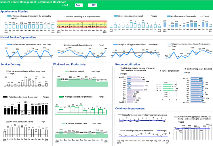
Figure 1. An example of medical center management performance dashboard | Source: The KPI Institute (2023), Medical Practice Dashboard
Major principles for effective KPI data visualization
To harness the power of KPI data visualization effectively, organizations should adhere to a set of key principles as best practices:
Clarity and simplicity: Prioritize clarity and simplicity in data visualizations by avoiding cluttered charts and excessive complexity that may obscure insights.
Contextualization: Provide context for visualized KPIs by including relevant information, such as benchmarks, targets, and historical trends.
Visual Hierarchy: Establish a clear visual hierarchy to guide the viewer’s attention towards the most important KPIs and trends.
Storytelling: Utilize data visualizations to tell a compelling story, highlighting key insights and communicating performance trends effectively.
KPI data visualization has emerged as a transformative tool to support organizations in extracting meaningful insights from their vast data repositories. The first move for effective KPI data visualization is to embrace data culture across all organizational levels. The second step is to determine data constraints, such as the type of data, the number of variables, and the type of pattern one is trying to show (comparison, part-to-whole, hierarchy, etc.).
If you want to achieve effective KPI visual representations to support the decision-making process,? sign up for The KPI Institute’s Certified Data Visualization Professional course.