When implementing a Performance Management System (PMS) based on Key Performance Indicators (KPIs), the organization needs to create a favorable context to plan, organize, coordinate, communicate, and control performance. Such endeavor implies multiple initiatives, resources, and most of all, employee engagement. However, challenges are inevitable. These challenges often arise from the mechanisms and relations by which the KPI Measurement Framework and KPI-related processes are controlled and directed.
As such, unclear definitions and overlap of roles and responsibilities and lack of ownership, commitment, or clarity in terms of target achievement accountability are some of the most common challenges that may endanger the achievement of strategic business objectives and goals. The root cause of these dysfunctions is that KPI governance structure has never been clearly defined or described.
KPI governance structure
There are multiple parties involved in governing and managing KPI-related processes, and all play a specific role in promoting, supporting, designing, implementing, and maintaining the KPI measurement framework. A typical KPI governance structure includes the following components:
Performance Manager – Responsible for supervising the entire process
PMO specialists – Support the persons involved in the process, analyze data and check it for accuracy
KPI owner – Responsible for KPI target achievement
Data custodian – Responsible for KPI results collection/ data collection
KPI owners and data custodians have two of the most operational KPI governance roles within the organization. While the data custodians are responsible for ensuring that high-quality KPI data is gathered and communicated to all interested stakeholders, the KPI owners are mainly responsible for the KPIs under their management, making sure that they are viable and measurable.
KPI owners’ role and responsibilities
Within a standard Data Governance Framework, a data owner is in charge of ensuring that processes are followed to guarantee the collection, security, and quality of data. Frequently in a senior or high-level leadership position, a data owner has a role in planning the data, supervising access to it, ensuring data security, and defining a repository to contextualize the data.
Similarly, a KPI owner is responsible for overseeing the process, function, or initiative that the KPI is monitoring. That person has access to the data, knowledge of how that domain functions, and, most of all, is empowered to make decisions on improving operations.
In a nutshell, the KPI owner is responsible for reaching KPI targets through the following actions:
Monitoring (looking at) the measure over time
Interpreting its trends and patterns and seeking causes for them
Communicating this information to people affected by that performance area
Initiating action to improve performance in that area
Following up to be sure that actions have the desired effect on performance
Data custodians’ role and responsibilities
Within a KPI governance framework, data custodians are involved in the design of performance data collection, receipt and storage, process, analysis, reporting, publication, dissemination, and archival or deletion of data. The daily processing and management of performance data are therefore under the control of appointed data custodians. The person assigned with such a role must demonstrate high levels of data literacy as well as skills in data management software systems and tools.
Other required competencies for a data custodian are as follows:
The ability to intuitively identify and recognize any variance from the data quality dimensions
Focused on the improvement and automation of the process
Can competently apply the behaviors and skills of managing change
Uses change as an opportunity to advance business objectives
Works to minimize complexities, contradictions, and paradoxes or reduce their impact
Unifies leadership support for direction and smoothens the process of change
We may say that the data custodians are the guarantors of a sound performance data gathering process. Because of that, the profile of such an individual should also cover an analytical mind, experience in measuring and reporting metrics/ KPIs, information technology skills (basic Microsoft Excel or more advanced data analysis tools, depending on the data architecture`s level of automation), and a strong sense of integrity and ethics.
While some companies may hire specialized professionals, such as data analysts, other organizations may assign the data custodian roles to the existing employees.
Conclusion
Building a strong KPI governance team is a key part of the KPI-related processes and functionalities and of successfully overcoming the inherent challenges of implementing a PMS. Once the right people are on board, they need to be guided towards making the right decisions and focusing on the correct issues, ultimately making sure that information is being governed for a purpose that aligns with business objectives.
“If you aim at nothing, you will hit it every time.” — Zig Ziglar
When the cost of managing and measuring your performance is less than the tragic risk of hitting nothing, it pays to get your KPIs right.
KPIs, or key performance indicators, can prove that success is a result of not just one huge undertaking but a series of actions. These actions are taken by decision-makers that consistently rely on data rather than guesswork.
In this guide, you will learn the basics and benefits of KPIs and beyond. Explore the top articles, webinars, reports, and other materials produced by The KPI Institute, a leading global research institute specializing in business performance and KPI research for over 17 years.
Topics include:
What Is a Key Performance Indicator?
Why Companies Should Use KPIs
KPI Examples
Applying the KPI Best Practices
The KPI Measurement Framework
What Is a Key Performance Indicator?
The definition of a KPI, according to The KPI Institute, is “a measurable expression for the achievement of a desired level of results in an area relevant to the evaluated entity’s activity.”
“If a decision support system is put in place, users need the right data granularity and the guidelines or context for making the right decisions. All of these reasons have an underlying story, and top-performing organizations are able to clearly communicate that story to their employees.”
“As performance management & measurement is shaping up as a fundamental capability for organizations across the globe, there are still multiple challenges to be overcome.”
“Nowadays, the challenge is not about accessing information, as most companies are managing large volumes of data. The challenge is to decide which data is the most important for decision making.”
“What have been some of the changes that the Performance Management field has experienced over time? What are some one-size-fits-all style KPIs that any company can employ?”
Discover the role of KPIs in designing a rigorous Performance Management System (PMS) to ensure an optimized implementation across all organizational levels.
Compare KPIs and other performance evaluation criteria, identify the common KPI pitfalls, and discover how to use KPIs to create synergies between departments.
“In many cases, the key performance indicators (KPIs) monitored do not seem relevant as they are not connected to the strategy. To better understand how this problem can be addressed, we must first identify its possible causes.”
“What are the most important guidelines to follow when selecting KPIs for strategic objectives? What are the most efficient KPI Selection techniques, most recommended KPI selection environments, and some Value Flow Analysis technique examples?”
“A KPI implementation project plan provides a structure for the implementation of an organization’s performance management system. Once the project plan is set, all types of activities would have a clear deadline and designated responsibilities.”
“When formalizing and implementing a performance management system (PMS) based on key performance indicators (KPIs), there are multiple activities to be considered and many stakeholders to be engaged in the process. Therefore, you’ll need a project plan to make performance management an ongoing process within your organization.”
“An important component of performance measurement is represented by the data collection capability. However, when applied in the organizational context, this process is neither easy nor lacking obstacles, as practitioners often discover.”
“KPI selection is a process which seems simple, yet is inherently complex, due to the interdependencies involved. Here are 15 things to consider before embarking on this journey.”
“Just reporting performance data will not ensure the improvement of results. Improvement is only possible when decisions are made based on the insights provided by data.”
KPIs are not just about understanding and working with numbers. Using KPIs requires stakeholders to fulfill a vision and commit to ensuring success across all levels of their organization. If you would like to learn how to select the right KPIs for your organization, sign up for The KPI Institute’s Certified KPI Professional and Practitioner live online course today.
The term value flow analysis is derived from the concept of value stream mapping, which is deeply rooted in activities relating to producing and delivering a product or a service to the customer. James Womack, Daniel Jones, and Daniel Roos first formulated the value stream concept in their book entitled ‘The Machine that Changed the World”. Published in 1990, the book was considered to have launched the Lean movement, which popularized methods of systematic reduction of waste in working processes.
James Womack and Daniel Jones further took on the concept in their book entitled “Lean Thinking,” published in 1996. It defines a value stream as “the set of all specific actions required to bring a product or service through critical management tasks.” (Womak & Jones, 1996, p. 19) According to Drew Locher, the author of “Value Stream Mapping for Lean Development,” “Value stream mapping is an effective and proven tool to assess existing business processes and to re-design them based on <Lean> concepts.” (Locher, 2008, p. 1)
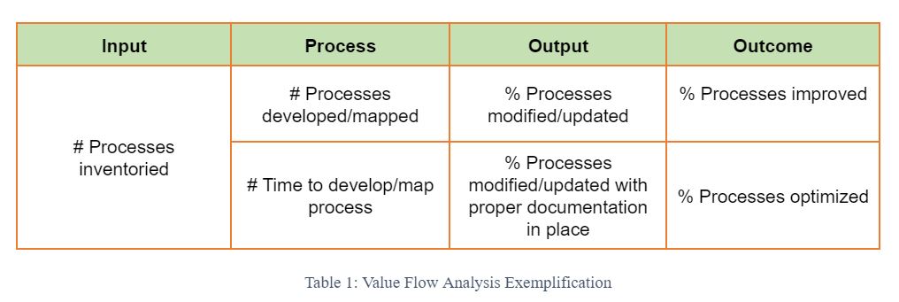
As related to process performance and a potential model for linking processes to organizational strategy, value flow analysis enables the categorization of KPIs through their contribution to the main stages in the value generation chain: input, process, output, and outcome. Furthermore, this distinction allows for a deeper understanding of each KPI’s contribution to the organizational objectives set, based on clear assignation to the following listing:
Input metricsare associated with the quantity or quality of the resources engaged in a particular task or operational activity. Such metrics or KPIs will be generally linked to budgets, human capital, and other tangible assets the organization brings to the production/development process. Input metrics will generally be related to achieving financial objectives, such as maintaining the company’s financial discipline, internal processes objectives like the efficient use of company resources, or people-related objectives, such as the availability of human resources for the organization.
Process metricsareaffiliated with the transformation process that is involved with taking the company’s inputs and converting them into desired outputs for the organization. Process metrics commonly reflect on the activities or actions that are taken to convert inputs into organizational outputs. Process metrics will reflect on the achievement of internal processes objectives as a rule. Quality and time-based considerations will be best reflected with selecting and establishing process metrics or KPIs for the organization.
Output metricsareindicative of the results obtainedwith the designated inputs of the organization. Output metrics or KPIs will commonly reflect on a backward or reversed control representation of the efficiency with which the company’s resources or inputs are used to produce final products or develop end-user services.
Outcome metrics reflect the ultimate effect on the value of the organization’s production and service development processes. Outcome metrics or KPIs will frequently support top-level objectives while reinforcing the company’s overarching purpose as reflected in its strategic themes. Although not generally used with the more common Value Stream Mapping technique, outcome metrics are desirable because they allow for a more valid association with organizational objectives by organizational layers.
Documenting processes by use of the value flow analysis serves multiple purposes. The quality of process outputs and outcomes is directly related to the quantifiable amount of inputs, efficiency, and speed with which they are used in the process of their transformation. As quantifiable measures of a company’s operational performance, KPIs are therefore an effective instrument for decomposing processes by their main value creation stages:
Quantitative KPIswill stand for the measurable characteristics of the inputs that go into the value creation chain. Quantitative KPIs easily relate to an objective appreciation of the amount of inputs or resources the company uses to obtain its desired outputs and positively influence envisioned outcomes.
Time-related KPIswill be easily identifiable with the activities or actions that are undertaken as part of a process. Time-related KPIs will always be process-based, given that they are the only ones capable of accurately reflecting on the speed of the transformation process.
Qualitative KPIswill relate mainly to the outputs and outcomes in the company’s value creation chain while reflecting on the quality of results produced as part of the transformation process. Qualitative measures are still quantitative; however, they possess the additional capacity of reflecting on the quality of operations conducted.
These particular characteristics make KPIs easily responsive to the four stages in the value creation process and are also similar to the characteristics of organizational objectives, which are either quantitative (i.e., Reduce operating costs) or qualitative (i.e., Improve service quality). This, in turn, makes it easy for an organization to assign KPIs to desired business objectives in a concentrated effort of monitoring the high-level strategies or the company’s follow-through on its strategic themes.
Some say when you fail to plan, then you plan to fail. This is the reason why you should establish a solid strategic planning process for your company. But strategic planning won’t succeed without the right data. Data gathering may sound simple, but you should not underestimate it. Why does it matter and how should you gather your company’s performance data?
Performance monitoring is a systematic process taken by the management in order to track the company’s performance and drive results and continuous growth. Performance monitoring could also send signals to top management which part of their business operations are failing or working below expectancy. This process plays an important part in the strategic planning initiative.
In order to successfully monitor company performance, the management should be able to gather corporate performance data swimmingly.
Data Gathering
Data gathering in general should start with KPI activation. This KPI activation consists of four different steps: meeting with the data custodians, securing the activation budget, designing the data gathering template, and communicating the template to the data custodians. KPI activation is a step that allows management to develop infrastructure for capturing and managing data.
After KPI activation is done, the next step is the ongoing data gathering process. This is where the management or the performance management team sends the KPI data gathering notification to the KPI custodians and receives the data relevant to performance monitoring. For this step, it is imperative for the performance management team to gathers and centralize the relevant data before checking the data quality.
After sending the KPI data gathering notification, the management or the performance management team could also send the KPI custodians a reminder via email to make sure the data custodians prepare the data needed.
Once the relevant data is gathered, the performance team should check the quality of the data before calculating the KPI results and analyzing the data. The quality of the data should be checked based on multiple dimensions.The main dimensions are Accuracy, Completeness, Consistency, Conformity, Timeliness, and Uniqueness. In reality, the performance management team may find the relevant data does not meet those requirements/quality. When the data does not meet a certain quality, it is preferred for the top management or the performance management team to clarify the data to the data custodians.
Data analysis is a set of processes of examining, transforming, and modeling data to generate relevant business insights that can be used in the decision-making process. In analyzing KPI results, the performance team should use analytics.
The final step of data gathering is to generate a performance report. In this phase, data custodians, the report generator, and the strategy performance team are collectively responsible for compiling all performance results, business insights, and analysis in a certain format for the decision-makers.
In conclusion, a solid data gathering enables decision-makers to set the right company’s objectives for the next period. A solid data-gathering process will help the performance management team provide the performance report required by the top management faster, making the top management adjust the company’s strategy and objectives properly. If you want to learn more about how you could establish a solid data gathering process, sign up for The KPI Institute’s Certified KPI Professional and Practitioner course.
A well-functioning KPI measurement framework is more important then ever. In the fast-changing post-COVID-19 environment, organizations without a well-designed performance management system are not able to collect data-driven and real-time feedback, which is more important than ever because organizations need to make quick decisions as they respond to new challenges.
Organizations with no formal KPI measurement framework in place might consider implementing KPIs, and thisprocessstarts with a KPI implementation project plan.
The importance of a KPI implementation project plan
A KPI implementation project plan provides a structure for the implementation of an organization’s performance management system. Once the project plan is set, all types of activities would have a clear deadline and designated responsibilities.
Because a KPI implementation plan lays out all pertinent details, it promotes effective communication among the stakeholders of the project and reduces the impact of the project implementation gaps. Some of these gaps are the lack of buy-in from key stakeholders, unrealistic deliverables, and the inefficient assessment of organizational resources.
A good plan also serves as a compass for employees and other stakeholders in uncertain times because it guides stakeholders/employees towards reaching the strategic objectives of the organization.
Project planstages
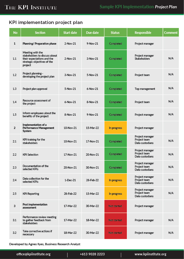
The most common elements of a KPI implementation project plan are key activities, deadline, responsibility, status, and comments.
A KPI implementation project plan must be aligned to the organizational strategy and objectives. Before the implementation starts, a meeting with the stakeholders of the project should be organized to discuss their expectations and make sure that everybody is on the same page. After the plan is developed by the project team incoordination withthe project manager, the resource assessment of the project needs to be created. Then, another meeting withall employees is necessary in order to share the vision and benefits of such a project and delineatethe first tasks to be finalized.
The second phase is the actual implementation of the performance management system. Start with proper training for the stakeholders to establish a common languageand to avoid any misunderstanding. The appropriate KPIs should be selectedin a KPI selection workshop. Then, they should bedocumented using a pre-defined, standardized template. Moreover, the data should be gathered and reported by the data custodians. The report should be presented with good visuals that are easy to interpret. Thiswill help ensure a clear and effective decision-making process.
During the post implementation assessment phase, aperformance review meeting should be conducted to gather feedback from internal stakeholders and analyze the situation and the progress of the result. It is also important to evaluate the possible corrective actions to be addressed in the performance management system.
KPI implementation project plan example:
Conclusion
In order to arrive at the benefits of a well-functioning KPI management system, companies need to understand how to efficiently implement it and to ensure that all employees have a clear picture of the whole system.