How data-ink ratio imposed Minimalism on data visualization

Image source: Алекс Арцибашев | Unsplash
In 1983, American professor of statistics and computer science Edward Tufte introduced the concept of data-ink ratio in his famous book, “The Visual Display of Quantitative Information.” Data-ink ratio is a pioneering disciplinary theory in data visualization that has been highly influential in recommended practices and teachings, with its excellency reflecting a minimalistic style of design. The art movement of Minimalism is noticeable in Tufte’s theory, even though he did not deliberately mention it. However, academic research shows that data-ink ratio generated mixed responses, resulting in the need for more complex frameworks in data visualization.
What is data-ink ratio?
Tufte’s Data-Ink Ratio is built on his preposition that “data graphics should draw the viewer’s attention to the sense and substance of the data, not to something else”. The conceptual formula is:
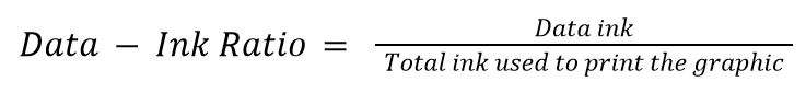
“Data ink” means what is absolutely necessary to show the data. The word “ink” is used because the theory was formulated in the age of print graphics dominance. The equivalent of “ink” in the digital world today is “pixels.” Data-ink ratio aims to find and maximize the share of informative elements out of the total elements used in a chart, raising a ratio of 1 as the highest goal. A visualization with such a ratio is the one that only contains elements that show the data, with no decorations or redundancies.
Tufte asserted this goal by articulating two erasing principles: “erase non-data-ink, within reason” and “erase redundant data-ink, within reason.” For these two types of ink, he coined the term “chartjunk.” The excessive elements to get rid of include decorations, background images, unnecessary colors, gridlines, axes, and tick marks. He said that the principles should be applied through editing and redesign. This led to the structuring of the process of data visualization as a cyclical one that ends when the most minimal output is reached.
The cycle goes as follows, in Tufte’s words:
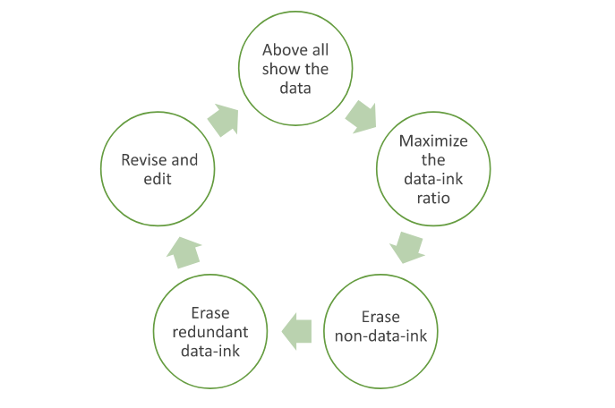
Illustration by Islam Salahuddin
Minimalism in data visualization
Minimalism became one of the most important and influential movements during the professor’s young age in the 1960s. Minimalism is defined by Cambridge dictionary as “a style in art, design, and theater that uses the smallest range of materials and colors possible, and only very simple shapes or forms.” It is a kind of reductive abstract art that is characterized by “plain geometric configurations” that lack “any decorative… flourishes.”
That can be juxtaposed with what Tufte instructed under the data-ink ratio theory: to achieve a data visualization that is simple and, therefore, minimal. Tufte’s theory suggests that such simplicity can deliver a message that is clear, precise, and efficient. As a result, it could reduce the time required for the user to perceive the visualization.
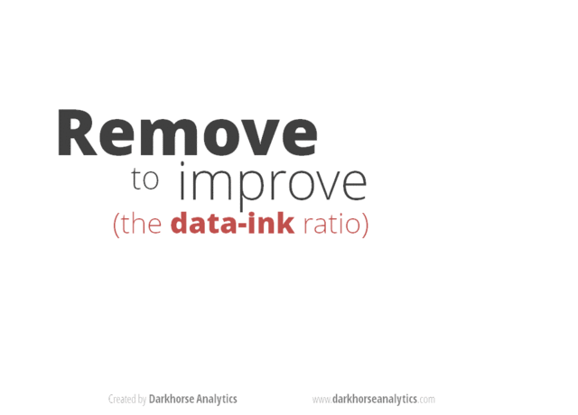
One of the many posts surfacing the internet to exemplify applying Tufte’s reductive principles on a bar chart. | Image Source: Darkhorse Analytics
Tufte’s priorities match the needs of the fast-paced business world. In business, saving time means saving cost and therefore maximizing profit. It was in the nineties, less than a decade after Tufte’s theory, when the accumulation of information started to skyrocket with the advancement of the World Wide Web. Businesspeople seemed to be lacking even more time with more information to consider, and a minimalistic approach seemed like a solution.
Minimalism did not only impact data visualization, but its effect also reached almost every corner of the human computer interaction (HCI) field. For example, as the internet became more widespread, search engines started to develop and became so powerful that they began to impose their own rules of the game. Because of the nature of how search engines work, the minimalistic structured design of web pages was more attainable for the engines to read and rank, and therefore more preferable and reachable for the audience.
For similar benefits, like reach in webpages and efficiency in data visualizations, minimalistic design became so invasive in all computer interfaces over the years. Today, minimalistic design is usually described as “modern design” and recommended to every designer building a user-interaction system, from mobile apps to webpages to data visualizations.
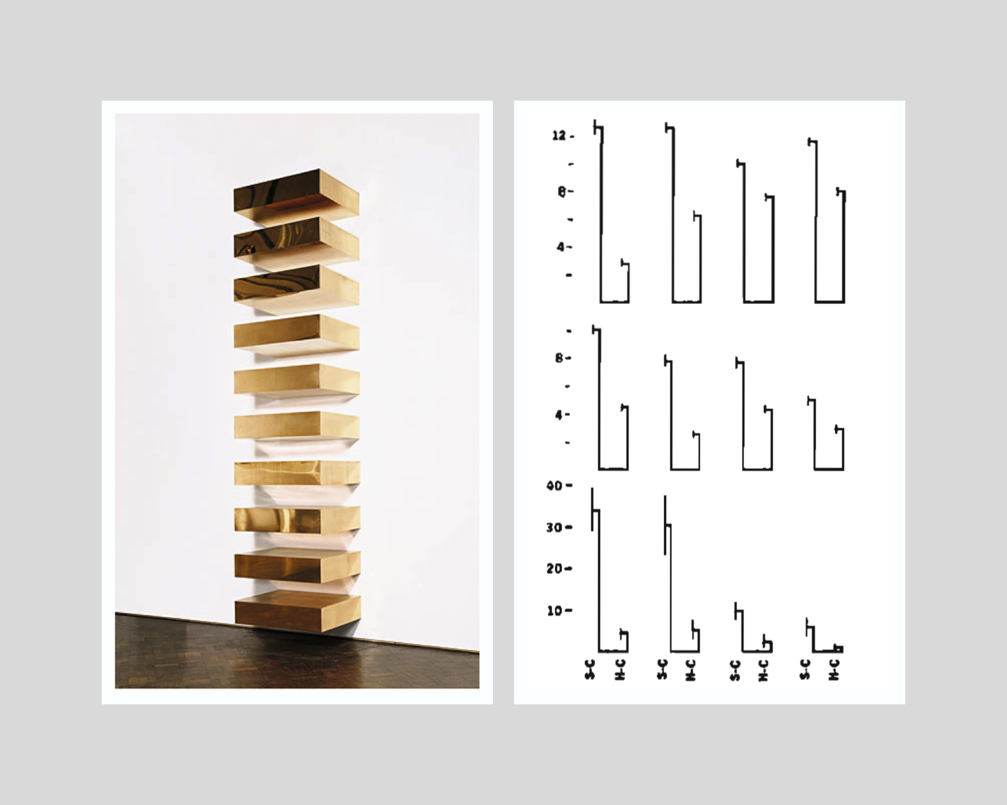
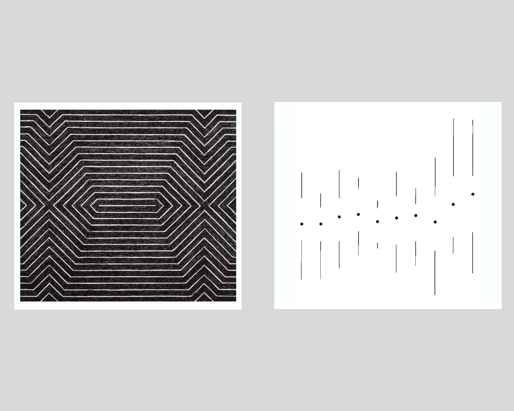
On the left: Donald Judd’s minimalist installation, Untitled, 1969 (photo from: Guggenheim Museum, New York) | On the right: Tufte’s minimalist variation of a double-bar chart with error lines. | Collage by Islam Salahuddin
Reviews of data-ink ratio’s minimalism
Despite presenting his hypotheses as proven facts, Tufte had never empirically tested his promised achievements that can be reached by minimalistic design. It was not until the beginning of the nineties that academic research started to put the claims under the microscope.
The initial research findings struggled to prove the hypotheses. However, a major multi-experiment research paper in 1994 found that some non-data-ink and redundant data-ink, especially backgrounds and tick marks on the y-axis, may decrease accuracy and increase response time (which is proportionally bad). Meanwhile, the other ink that Tufte considered to be chartjunk and called for its removal whenever possible, like axis lines, was proved to increase performance in some cases. The negative effect was clear in some chartjunk types, like axis lines, but was less certain in others, like three-dimensional charts.
Such experiments were still built on the same proposition of Tufte that graphical excellency means clarity, precision, and efficiency but found that the relationship between data-ink ratio and excellency in that sense can hardly be linear as Tufte suggests. The paper states that “effects of ink are highly conditional on the features of the graph and task” and therefore “simple rules like Tufte’s will not suffice.” Instead of indicating that all non-data-ink and redundant data-ink should be erased, the authors call on data visualization designers to determine whether the use of any ink will facilitate or interfere with reading a graph, depending on its context.
Later research even questioned Tufte’s components of graphical excellency, especially the presumed all-cases importance of response time factor. An empirical paper in 2007 found that users may prefer non-minimalistic visualizations over Tufte’s minimalistic ones, partially because they may find the latter boring. This is a criticism that both Minimalism art and statistics face and a perception that Tufte tried to avert with his rule. Boredom should not be treated as a minor problem because it means less ability to induce attention. A visualization’s ability to generate attention is the gateway to the viewer’s perception in the first place.
Attention is one of the criteria that Tufte’s rule overlooks. Other significant factors are memorability and engagement. More advanced experiments in 2013 and 2015 re-asserted chartjunk as not always harmful. In some cases, it may even increase the memorability and engagement of a visualization. Attributes like color and human recognizable shapes, icons, and images can enhance memorability due to their ability to activate more parts of a viewer’s brain, leveraging its natural tendency towards what is familiar rather than what is just minimal.
Despite their popularity, chartjunk and similar terms also appear to be highly open to interpretation among practitioners. Interpretation can be affected by an individual’s circumstances that include culture, personal style, preferences, and views, as well as constraints of skills, tools, and user’s priorities, according to a discourse analysis that was published in 2022.
On the left: Frank Stella’s minimalist painting, title not known, 1967 (photo from Tate Modern) | On the right: Tufte’s minimalist variation of a multiple vertical box and whisker plot. | Collage made by Islam Salahuddin
How to make sense of the previous discussions
The growing body of research shows that data visualization is a task that can hardly be led by only a one-factor rule like data-ink ratio. It shows that even the simple task of choosing what elements to include or exclude in a visualization remains largely an uncharted territory and needs further examination.
However, one of the common underpinnings that all theoretical works share is a consideration for the importance of context in which a visualization is designed. To be fair, even Tufte himself did not ignore this consideration after all and emphasized that certain principles have to be adopted “within reason.” Asserting the “reasonability” factor, he deliberately mentions in the Data-Ink Maximization chapter of his book that maximizing data-ink “is but a single dimension of a complex and multivariate design task.” He recognized the possible existence of factors other than excellency that come into play, including “beauty,” even if he did not prioritize them.
Therefore, synthesizing all the critiques arising against Tufte’s rule of data-ink ratio appears to be possible by quoting Tufte himself. He said that determining to which extent the data-ink ratio should be maximized rests on statistical and aesthetic criteria.” This allows data visualization designers to figure out the sweet spot where a visualization delivers what it intends to and, at the same time, does not alienize itself for the sake of being minimal.
All in all, minimalism can be considered one of the means to design a great data visualization, but not a goal. After all, the goal will remain to deliver the intended message to the audience so they can perceive it best.
Want to understand how visual representations can support the decision-making process and allow quick transmission of information? Sign up for The KPI Institute’s Data Visualization Certification course.

Tags: Data Visualization, data-ink ratio