In today’s data-driven world, organizations are constantly grappling with an abundance of data coming from various sources and in different formats. Data integration has emerged as a critical process that enables businesses to connect these disparate data sources by consolidating them into repositories called data silos, creating a comprehensive and unified view of their information. This single source of truth empowers organizations to make more informed decisions and derive valuable insights for better business intelligence.
These disparate data sources can vary in type, structure, and format. Successful data integration finds a way to connect these sources, either by building relationships between them where they reside or by periodically extracting, transforming, and loading data (a process known as ETL) from these sources into one big database dubbed a data warehouse.
For example, when sales data is combined with customer data, the organization can gain a deeper understanding of customer behavior and preferences, which would allow personalized marketing efforts and improved customer satisfaction.
Data integration can be challenging as there is no one technical way of implementing it. Rather, the process depends on the needs and resources of each organization. Organizations with no technical capabilities would need to seek a third-party service provider.
Despite the variance across organizations, one thing remains consistent—every data integration process should be approached systematically by taking into consideration the following key strategic steps:
Defining integration goals: Organizations need to clearly outline the objectives and outcomes they want to achieve through data integration.
Assessment of data sources: This includes identifying all the data sources within the organization and understanding the structure, format, and quality of the data coming from each source.
Data mapping and transformation: This entails defining how different sources will be mapped to a common format. This may involve cleaning and preparing data silos in the first place.
Defining technique and tools: Based on the previous steps, a technical decision should be made on how to do the integration and the degree with which manual labor and automation will be utilized.
Building integration processes: This answers the question, “How will future data be integrated as well?” It involves defining workflows and processes that should be scalable, reliable, and capable of handling future data growth.
Testing and monitoring: As data integration is a continuous process, organizations should always test and monitor the integrated data thoroughly to ensure accuracy, consistency, and reliability. Validating the integration results should be done against predefined criteria, along with making necessary adjustments if discrepancies are found or to adapt to changing data sources and business needs.
In conclusion, data integration plays a crucial role in enabling organizations to harness the full potential of their data. By connecting disparate data sources and creating a single source of truth, organizations can unlock valuable insights, improve decision-making, and enhance operational efficiency. Following a systematic approach and leveraging appropriate integration tools lets organizations achieve successful data integration and gain a competitive edge in today’s data-driven landscape.
The business intelligence and analytics industry reached over $ 19 billion globally in 2020, albeit the derailed economic performance caused by the pandemic. The business intelligence market growth experienced a 5.2% increase, and the data analytic growth rate is expected to rise in the coming years as companies realize the need to manage data to make better decisions.
According to Angela Ahrendts, a former retail Vice President at Apple Inc., customer data is the most significant differentiator among businesses in this era. Companies that know how to maneuver heaps of data to create strategic moves usually succeed. To determine how companies adopt and implement data analytics, let’s first understand how data can make a company’s operations efficient.
Data Analytics: Four Ways to Increase Company Performance
As discussed earlier, data analytics is beneficial for making more accurate business decisions. Managers and executives can take action on the data insights they get to drive better competitive advantages in their markets. There are four ways data analytics can accelerate business performance:
The first way is by creating informed decisions. One of the key benefits that businesses look out for when dealing with data analytic solutions is developing better and more accurate decisions from the insights they get from analyzing data.
There are two processes that ensure the development of better decisions: predictive analytics and prescriptive analytics. Prescriptive analytics are utilized to project the way companies react to forecasted trends, whereas predictive analytics focus on events that might occur after analyzing collected data.
Improving efficiency is another route. Data analytics is highly beneficial especially in the operation management for streamlining operations. For example, companies can retrieve and assess their data relating to supply chains to discover where delays in their supply networks happen or to forecast areas where problems emerge and use these insights to prevent any issues.
Data analytics also enables risk mitigation. To cut down losses, data can be utilized to reduce physical and financial risks in business. Through collecting and assessing data, inefficiencies can be either identified or predicted. Also, potential risks are revealed to inform management on creating preventive policies.
Lastly, data analytics enhances security. As many businesses confront numerous data security threats in today’s era, it is essential to keep the company’s cybersecurity out of dangerous attacks that cause financial or brand image blow. A company can evaluate, process, and draw insights from its audit logs to showcase the source of previous cyber breaches. The outcome of this exercise would be to recommend possible remedies to the problem.
Join The KPI Institute’scertification course on data analysis today to learn more about data analytics, improve your analytical skills and make wise business decisions.
Google Sheets needs no further introduction, but let me make a reminder that it builds on arguably one of the simplest cloud-based storage solutions, Google Drive. That will help us build a basic data warehouse that will be connected to the visualizations, as explained later in the steps. Datawrapper is also a famous online-based data visualization tool that is commonly used by news organizations, but also can be used by any business, as we will see in the how-to section of the article.
How-to time!
The how-to section will be divided into two parts; the first on how to establish the system, and the second on how to use it afterwards. These two will be followed by a final part that includes additional tips to keep the system sustainable and in best shape. So, let’s get started!
Part 1: Establishing the system
Step 1: Create your Google Drive data warehouse
If you are not using Google Drive for file storage at your organization, you can easily do so by creating an account.
On Google Drive > Click: Go to Drive > Click: Use another account > Click: Create account > Follow instructions
GIF 1: Creating a Google Drive account | Source: Author
Create folders to categorize and build a hierarchy for the data files that you’ll add later. For instance, you can create a folder for each division in your company and then subfolders for each team within the divisions.
On Home Page > Click: New > Click: Folder
GIF 2: Adding a folder on Google Drive | Source: Author
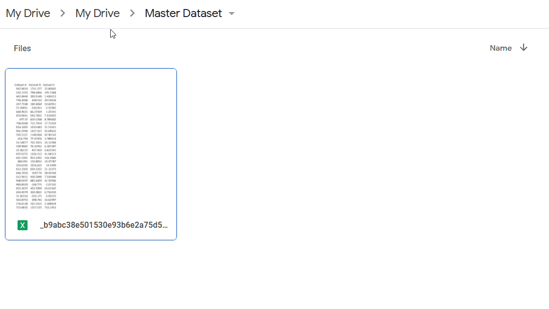
In each folder, upload the relevant data files.
Inside the desired folder > Click: New > Click: File Upload
GIF 3: Adding a file on Google Drive | Source: Author
OR
Drag the desired files/folders from your computer > Drop it in Google Drive
Give suitable access permissions to your team members to relevant folders.
Right Click on desired folder > From dropdown menu, Click: Share > Enter colleagues email addresses > Click: Done
GIF 4: Sharing Google Drive folder with colleagues | Source: Author
Step 2: Prepare datasets for Google Drive
As we will be connecting the datasets you’ve just uploaded to Datawrapper, we need to structure them in the way that the visualization tool can best read and interpret them. Here are a few things to make sure of:
There must be only one header row.
Do not merge cells.
Eliminate thousand separators as they will be automatically inserted on Datawrapper.
In the columns of values, do not mix letters with digits (You can add prefixes and suffixes later on Datawrapper, if you need to).
Inside the tables, do not leave any blank cells:
If the value is unknown/non applicable, put down a dash “-”.
If the value is zero, write a zero digit “0”.
Do not write any notes, source… etc. below the table in the spreadsheet. That can be added later on Datawrapper.
Step 3: Initiate your visualizations catalogue
Create a Datawrapper account.
On Datawrapper > Click: Login > Click: Create a new account > Follow instructions
GIF 5: Creating a Datawrapper account | Source: Author
Start creating one type of visualization for each type of data you have. The visualizations you’ll create will serve as templates for your colleagues when they start using the system.
On Datawrapper Dashboard > Click: Create New > Click: Chart
GIF 6: Creating a chart on Datawrapper | Source: Author
Connect the spreadsheet from your Google Sheets with the chart
First: Get a shareable link for the sheet | Go to your spreadsheet on Google Sheets > Click: Share > Click: Change to anyone with the link > Click: Copy link
GIF 7: Getting a shareable link from Google Drive file | Source: Author
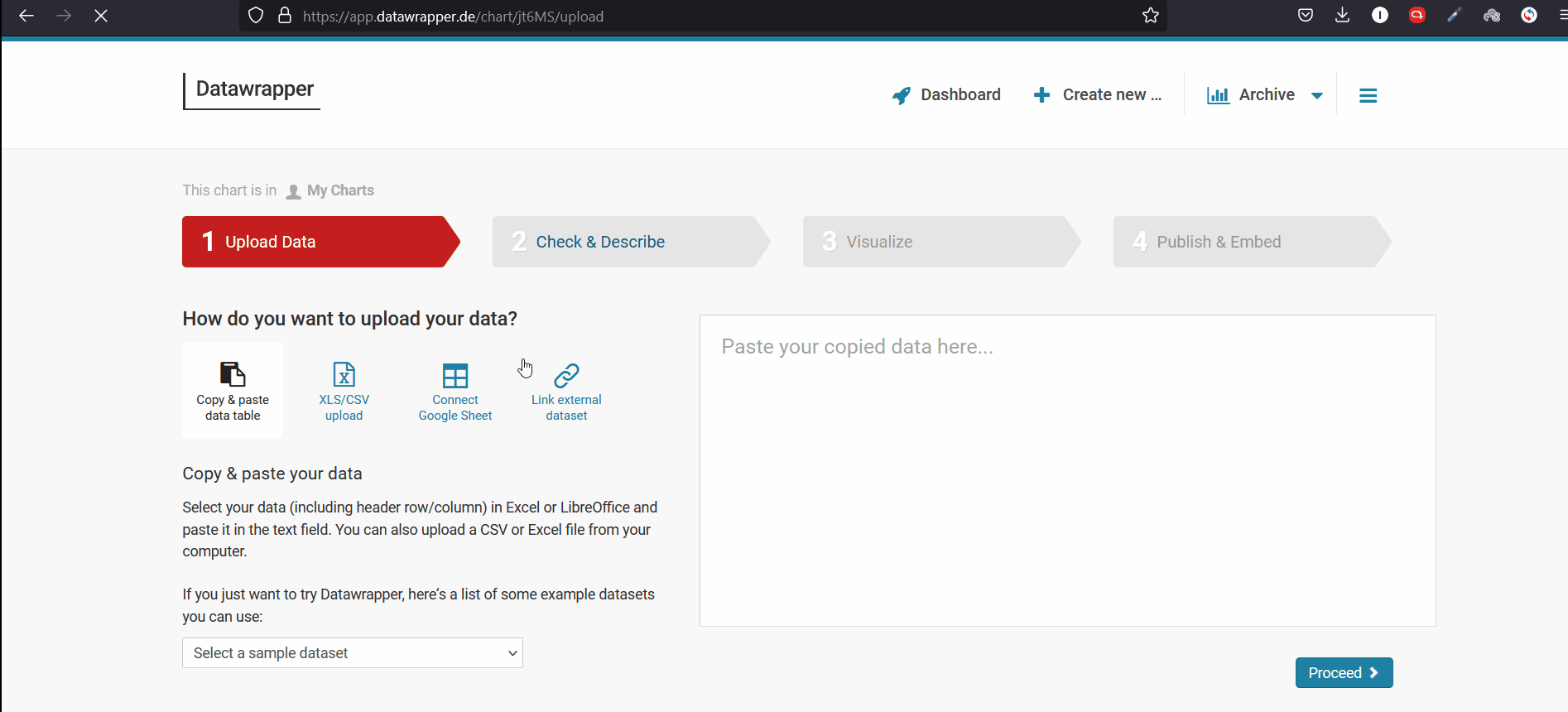
Second: Paste the link in Datawrapper chart | Go to Upload Data page on Datawrapper > Click: Connect Google Sheet > Paste the earlier copied link in the text box
GIF 8: Linking Datawrapper to Google Sheets| Source: Author
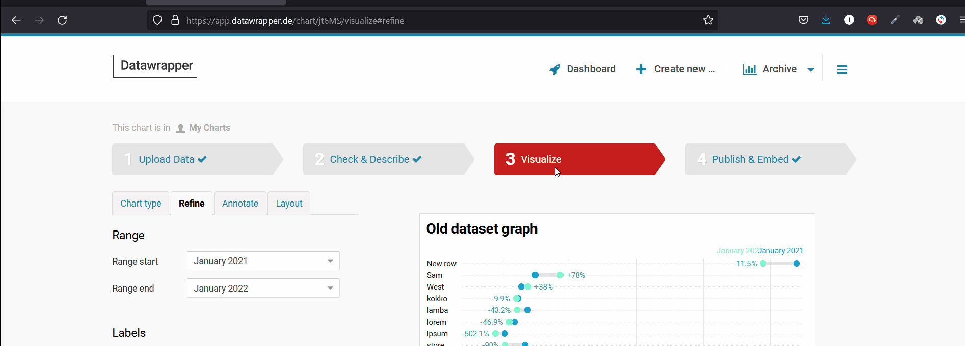
Proceed with Check & Describe and then Visualize your chart. For the purpose of this article, we cannot delve into all the options in Datawrapper, but it is encouraged that you play around, as the interface is super intuitive, and have a look at this tutorial from Datawrapper Academy. Also see this tutorial on how to choose colors.
Hint: You may need advice from a data visualization expert on what visualization type to choose for what type of data to achieve what purpose. Here are a few general guides for the most common types of data:
For timeseries data with one or two values, choose a line graph.
For timeseries data with more than two values, choose an area graph.
For a simple comparison, like comparing values over a few months, choose grouped column chart.
For a little bit more complex comparison, choose a single column chart with a filter above.
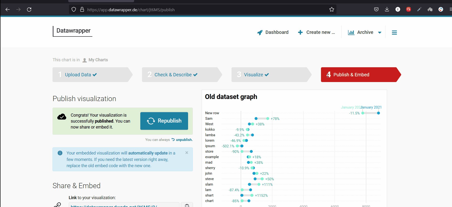
Publish your chart.
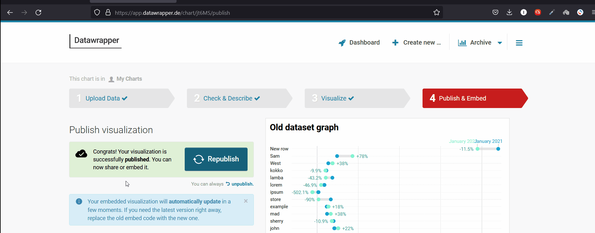
Go to Publish & Embed > Click: Publish Now
GIF 9: Publishing a Datawrapper chart | Source: Author
Create the previous steps to create one chart for each type of data as explained above.
Congratulations! You’ve successfully established your SSBI system with Google Sheets and Datawrapper!
Part 2: Using the system
Use 1: Creating new visualizations
Users in your team will be able to create new visualizations by following the same previous steps that you followed in Part 1, except:
Instead of creating a new visualization from scratch, they can duplicate an already formatted existing one, and just change the data source.
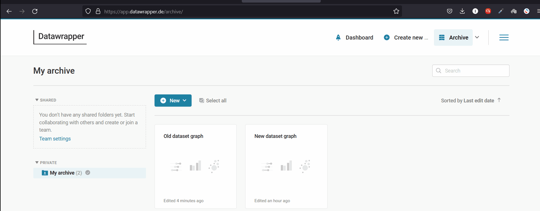
First: Duplicate an existing chart | On Datawrapper dashboard > Click: Archive > Choose the closest chart representing similar data > Click on the chart > Click: Duplicate
Second: Change data source | Copy and paste the new data source in the duplicated chart’s Upload Data page
Republish the chart to get the changes in the new chart reflected.
Go to Publish & Embed page > Click: Republish
GIF 10: Duplicating a Datawrapper chart | Source: Author
Use 2: Editing or updating existing visualizations
Users can also edit or update an existing visualization
If editing or updating the data itself is what is needed, you’ll need to edit or update the source data spreadsheet, and then go to the connected chart on Datawrapper to republish it, so it reflects the new changes in the data source.
Go to Google Sheets > Edit/Update the dataset > Go to the connected chart on Datawrapper > Go to Publish & Embed page > Click: Republish
GIF 11: Updating a Datawrapper chart | Source: Author
If editing or updating the chart itself is what is needed, you can head directly to the chart, make your changes and republish as in the previous steps.
Use 3: Exporting and embedding visualizations
Now, once the visualization is created, it can be exported in both interactive and static forms, to be embedded in web pages, pdf reports… etc.
To get an interactive version of your chart, you’ll need to get its HTML code and paste it into the editor of your web page.
First: Get the code | Choose the desired chart > Go to Publish & Embed > Under Embed code for your visualization > Click: Copy
Second: Paste the code in your web page | Go to the backend of your web page > In the text editor > Click: Text (Name and form below may differ) > Paste the code > Save the page > Should Appear on your front end
GIF 12: Embedding an interactive Datawrapper chart | Source: Author
To get a static version of your chart, you’ll just need to export it as an image, and then you can use it as any other image.
Choose the desired chart > Go to Publish & Embed > Under Export or duplicate visualization > Click: PNG
GIF 13: Embedding a Datawrapper chart as an image | Source: Author
Congratulations! The SSBI system is now up and running!
Additional tips
For this system to keep working efficiently and with as little flaws as possible, here are a few tips of good practice:
Make your data folders and files naming systematic and understandable. Then, name the connected chart with the same name of the spreadsheet. That will enable easier reaching for users in the future, using the search function on both tools.
You can let your team use the same account you created for Datawrapper, but that of course is not advisable. Instead, you can create teams within your account, and invite relevant members through email, assigning specific access authorities (in the same fashion of giving access on Google Drive). For more on this, you can see Datawrapper Academy articles on how to create a team and how to invite others.
Create a shared guide document with your team containing detailed steps, color codes and all standards for all the uses above (You are also welcome to embed a link to this article as well!).
As an appendix to that guide, add a part for the technical issues that faced your team when working with the system, and document how you solved them. Keep that part updated with every new issue coming up.
Assign yourself or one of your team members the responsibility of doing regular checkups on datasheets and newly created or updated charts, to make sure you are avoiding human errors and random technical ones as well.
Depending on your needs, you might consider paid plans of Google Drive and Datawrapper. Click here and here respectively to see what they have to offer.
That’s it! Thanks for bearing up with us all the way down to this point! Now before you go, we have one more thing to say. If you would like to discover new knowledge and the practical application of best practices used in analyzing statistical data, sign up for The KPI Institute’s Data Analysis Certification.
Gone are the days when analyzing and visualizing data to get information was a job that was limited to the IT and business intelligence (BI) divisions. Gone also are the days when the sole possession of knowledge, skills, and tools for data processing was in the hands of the “data guy.”
Data is becoming more and more abundant and essential for various business operations. This makes centralizing data processing on one or two divisions an inevitable bottleneck. On the other hand, analytics and visualization tools are becoming easier to use, with more intuitive user-friendly interfaces that require less and less technical expertise.
What SSBI Is About
Self-service business intelligence (SSBI), also called self-service data exploration, has become an important approach for data-driven insights in business. It means giving the ability to the wide range of employees who are not experienced with data to drive insights from relevant datasets and create exploratory visualizations to help them better understand the data and to use it in reports. It’s also a part of what is called data democratization if you’d like another fancy term on the plate.
It should be, however, distinguished from the second approach called dashboarding. While the latter should still be the responsibility of the experienced BI team, turning amounts of data to finely curated reports on the most important KPIs within a well-developed narrative can happen. The SSBI approach aims to:
Avoid time delays in data-driven decision making among the low and mid-level teams that may happen due to the centralization of analytics responsibilities.
Minimize intuition-based decisions that can be made by low and mid-level teams on a daily basis due to lack of analytical capabilities.
Enhance internal communication within the teams by making data-driven insights and visualizations easier to generate, and therefore more frequent integration of reports.
Enhance external communication of the organization as the insights and visualizations can also be easily used in developing publications, like blog posts for example.
Google Sheets and Datawrapper
There are tons of visualization tools out there that can enable you to create an SSBI system for your organization, some of which are technologically advanced, but each has its best uses and downfalls.
Just like Google Sheets and Datawrapper. The advantages of using these tools are the following:
– Businesses with no capabilities of experienced teams or infrastructure can implement the system.
– Anyone can use it as it requires little to no technical expertise.
– Visualizations can be easily duplicated and edited, suiting fast-based work routines.
– Visualizations can be easily well-formatted and laid out, leading to efficient reporting.
– Generate both interactive and static visualizations that are suitable for embedding in various forms of reports, from web-based all the way to paper-based.
Using a self-service BI solution can help streamline operations and support critical decisions. It also encourages collaboration, simplifies daily business needs, and increases one’s competitive advantage. With the efficiency brought by SSBI, businesses can focus on what matters most to them.
Want to understand how visual representations can support the decision making process and allow quick transmission of information? Sign up for The KPI Institute’s Data Visualization Certification course.
One of the greatest facets of my job at Yellowfin is the opportunity to continually scan the industry and see new innovations develop. Each year, we see many technological advancements and products come to market that influence the way we consume data and enhance the way we work with analytics.