This article is trying to answer the most common questions that pop up in a researcher’s mind, when trying to establish what scale to use in a marketing, or business, research: “Are there any differences in calculations when different scales are used?”, “Which advantages best suit a particular need?”, “Which is the best option for an unipolar or bipolar variable?”.
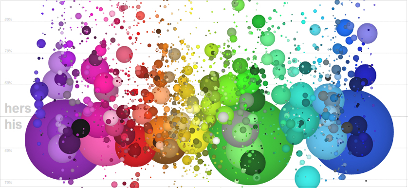
Discussions on data visualization have rapidly increased over the last years as more executives, managers, analysts and basically everybody, wish for a better understanding of the raw data behind every day dashboards, scorecards or presidential poll results. The struggle is to bring the raw data to life in a simple and comprehensible manner.
In the words of the data visualization expert Edward Tufte, “Graphical excellence is that which gives to the viewer the greatest number of ideas in the shortest time, with the least ink, in the smallest space.”
Data visualization is, roughly, the visual representation of information. From business executives and managers to business analysts or operations/manufacturing/supply chain managers, they all use charts, tables, histograms of other types of graphics to better visualize their data. Bar charts, line charts, scatter graphs and maps are simple examples of data visualization that have been used for decades.
The UK Accident & Emergency (A&E) units are currently facing a major crisis, with the patients queuing in ambulances for hours, as the service is clearly over-capacity. How has the emergency system met its target of attending patients, given the strain it has been under recently?