Many businesses believe great analytics starts with great data. Sure, data is important, but the best analytics actually start with asking the right questions. This is because each type of data analytics answers a specific question, giving you unique insights into your data.
There are four types of data analytics. Descriptive analytics looks at past data and tells you what happened. Diagnostic analytics goes a step further to explain why it happened. Predictive analytics uses patterns in the data to show what is likely to happen next. Prescriptive analytics suggests what actions you should take to get the best outcome.
Despite serving different purposes, each type has one thing in common. They help you make informed decisions based on what your data says. In the coming sections, we’ll look at each of these analytics types in more detail, along with examples.
Descriptive Analytics
Descriptive analytics is the simplest among the various types. As the name suggests, it simply describes what is happening now or what has happened in the past. It gives you a clear picture of the current state of things: a summarized view of your data through charts, dashboards, or business intelligence (BI) tools.
Descriptive analytics may be enough if all you want to do is monitor key performance indicators (KPIs) and targets like the number of customers, the amount of revenue generated, website visits, or even machine logs in more technical cases. It provides you with just enough insight to observe trends, catch anomalies, and track the metrics needed to make informed day-to-day decisions.
This dashboard summarizes hiring metrics, such as the total number of applicants, cost of hiring, revenue generated, and return on investment (ROI) for a recruitment company. It also shows the original source of each applicant (i.e., LinkedIn, referrals, or job boards). This lets the company easily see which sources bring in the most applicants and which ones actually lead to placements and returns.
If the company wants to determine which recruitment channels to keep or stop using, this dashboard gives them just enough insight to make the right decision.
Diagnostic Analytics
Whereas descriptive analytics summarizes events that happened, diagnostic analytics builds on this foundation by revealing the motivations behind those results. Diagnostic analytics explains all the trends, anomalies, and metrics that descriptive analytics brings to light. So, instead of just showing you what happened (e.g., telling you more people than usual visited your website this week), diagnostic analytics digs deeper to show you why it happened.
Data analytics reports often combine both descriptive and diagnostic analytics. Descriptive analytics is used to identify that a problem exists, and diagnostic analytics is used to evaluate the root cause of it.
Diagnostic analytics also involves a lot more one-off analysis because it often answers the question “what changed?”. As a result, analysts have to come up with hypotheses for why the change happened. They do this by collecting the data before and after the change happened, comparing the data, and drawing conclusions.
To get the depth of insight that diagnostic analysis can provide, analysts must use more advanced techniques like drill-downs, correlations, and root-cause analysis (RCA). Businesses use diagnostic analysis to find the source of a problem in order to fix it or to understand what is driving performance so they can double down on what works for their business.
In the example, a real estate company used descriptive analytics to identify that its revenue and profit decreased in February. Their next step was to use diagnostic analytics to uncover what caused this decrease.
After digging in, they found that the following properties caused a decrease in collected rent because some tenants moved out.
Similarly, if you saw that expenses increased, the diagnostic analytics would involve looking at individual expense groups and transactions. Management could then either deem those expenses necessary or look for ways to avoid them in the future.
Predictive Analytics
Once underlying drivers are understood, it’s common for organizations to look ahead. Predictive analytics responds to this need by utilizing patterns to estimate events likely to happen next. Predictive analytics uses patterns in your data to forecast future events. For example, if a store manager wants to know how many sales to expect within a particular month, predictive analytics can give a good guess based on historical data. Predictive analytics involves more advanced techniques like statistical modeling, machine learning, and historical trend analysis.
Businesses use predictive analytics to prepare for the future, mitigate risks, and capitalize on opportunities before their competitors.
Figure 4. Forecasting Sales Trends Using Predictive Analytics | Source: Created by the Author
Apart from forecasting future trends, predictive analytics can be used to predict the likelihood of an event (e.g., customer churn).
The most common predictive analytics techniques are:
Linear Regression: This assumes a linear relationship between two or more variables and is often used for time-series forecasting.
Logistic Regression: This returns a value between 0 and 1, which is perfect for predicting the likelihood of events.
Decision Trees: Used mainly for classification problems, these often consist of a list of yes/no branches that lead to certain outcomes. They are typically used to predict the outcome of a scenario based on multiple variables.
Neural Networks: These are computing systems inspired by the human brain, which consists of interconnected nodes (neurons) that try to identify patterns and derive a relationship from raw data. Often used when there is no linear relationship between the variables or to check the performance of other predictive models.
Prescriptive Analytics
Prescriptive analytics leverages all the insights from the other types of analytics to recommend the best course of action. It answers the question “Based on everything the data has revealed, what specific steps should we take to achieve the best outcomes?” Prescriptive analytics guides you through the use of optimization models, simulations, and AI-driven recommendations.
Here’s an example of how this type of analytics is used in the real world. A retail company used predictive analytics to find out that demand is going to go up next month. That’s useful, but what do they do about it? That’s where prescriptive analytics comes in. Instead of leaving the manager to guess, prescriptive analytics can tell you:
How many staff to schedule
How much stock to order and when
How much of the budget should be allocated to marketing
In summation, prescriptive analytics gives you clear, calculated, and optimized actions to take so that your data analytics don’t just end at gaining insight but instead lead to tangible business outcomes.
Figure 5. Overview of the Four Types of Data Analytics | Source: Adapted From the Author
Conclusion
These four types of data analytics are not mutually exclusive. Rather, they complement each other. For example, you can use descriptive analytics for explorative data analysis to form your hypothesis. You can then use predictive analytics to test your hypothesis and confirm correlation.
The most effective data analytics teams combine all four types, but this requires a special mix of skills and technology.
Companies that want to invest in descriptive or diagnostic analytics should focus on nurturing spreadsheet data visualizations and BI skills. Those who want to invest in predictive or prescriptive analytics require knowledge of statistics and statistical modelling tools such as R, SPSS, and Stata.
For anyone interested in a more holistic approach, knowledge of data governance and business intelligence infrastructure would make investing in all types of data analytics more effective.
**********
About the Author:
This article was written by Eugene Lebedev, managing director of Vidi Corp, a UK-based data analytics consultancy. He has delivered over 1000 data analytics solutions for more than 600 international clients, including Google, Teleperformance, and Delta Air Lines.
Today’s organizations drown in information waves. When leveraging data for actionable insights needed to drive strategic decision-making and sound performance measurement, visualization makes that data comprehensible and accessible. Specifically, key performance indicator (KPI) data visualization aims to communicate key performance metrics and trends in a way that is clear, concise, and impactful.
KPI data visualization benefits for organizations
KPI data visualization offers a multitude of benefits for organizations seeking to make data-driven decisions:
Enhanced data understanding: Visualizing KPIs makes it easier and faster to grasp complex data sets, identify patterns, and uncover hidden trends that would otherwise remain obscured in numerical form. KPI visualization provides insights regarding the entity’s current situation and helps a better understanding of the market.
Improved decision-making: Providing a clear and concise overview of key performance metrics, empowers decision-makers as KPI data visualization prioritizes evidence rather than intuition.
Effective communication and collaboration: Visual representations of KPIs facilitate effective communication and collaboration across teams by enabling stakeholders to share insights, align strategies, and achieve desirable goals. Additionally, KPI data visualization fosters accountability by transparently tracking performance against established goals, motivating individuals and teams to take ownership of their results, and promoting a data-driven culture within organizations to encourage data-informed decision-making at all levels.
Popular formats for KPI data visualization
The art of data visualization lies in presenting complex information in an informative and engaging way for all stakeholders. The most popular and effective techniques are as follows:
Charts and graphs: Bar charts and line graphs are effective ways to show trends and comparisons. Bar charts are effective in category comparison within a single measure. The line graph is mostly used to visualize changes in one value relative to another.
Maps and heatmaps: These visual tools are perfect for showcasing geographical data and identifying areas of concentration or dispersion.
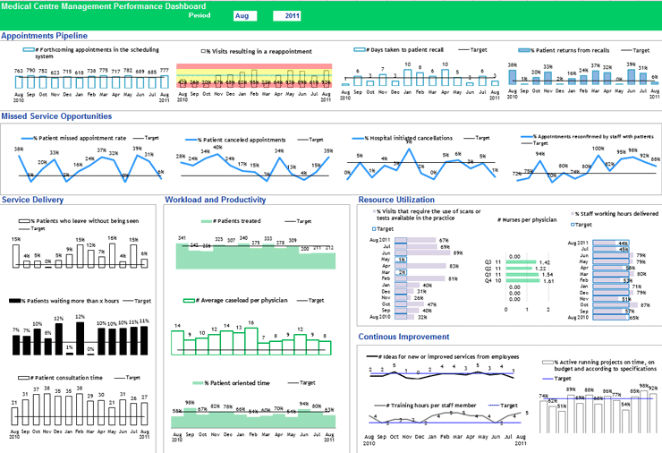
Dashboards: Combining multiple visualizations on a single screen provides a comprehensive overview of KPIs (see Figure 1).
Figure 1. An example of medical center management performance dashboard | Source: The KPI Institute (2023), Medical Practice Dashboard
Major principles for effective KPI data visualization
Clarity and simplicity: Prioritize clarity and simplicity in data visualizations by avoiding cluttered charts and excessive complexity that may obscure insights.
Contextualization: Provide context for visualized KPIs by including relevant information, such as benchmarks, targets, and historical trends.
Visual Hierarchy: Establish a clear visual hierarchy to guide the viewer’s attention towards the most important KPIs and trends.
Storytelling: Utilize data visualizations to tell a compelling story, highlighting key insights and communicating performance trends effectively.
KPI data visualization has emerged as a transformative tool to support organizations in extracting meaningful insights from their vast data repositories. The first move for effective KPI data visualization is to embrace data culture across all organizational levels. The second step is to determine data constraints, such as the type of data, the number of variables, and the type of pattern one is trying to show (comparison, part-to-whole, hierarchy, etc.).
If you want to achieve effective KPI visual representations to support the decision-making process,? sign up for The KPI Institute’s Certified Data Visualization Professional course.
In 1983, American professor of statistics and computer science Edward Tufte introduced the concept of data-ink ratio in his famous book, “The Visual Display of Quantitative Information.” Data-ink ratio is a pioneering disciplinary theory in data visualization that has been highly influential in recommended practices and teachings, with its excellency reflecting a minimalistic style of design. The art movement of Minimalism is noticeable in Tufte’s theory, even though he did not deliberately mention it. However, academic research shows that data-ink ratio generated mixed responses, resulting in the need for more complex frameworks in data visualization.
What is data-ink ratio?
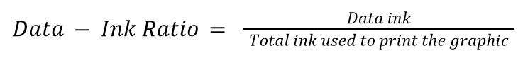
Tufte’s Data-Ink Ratio is built on his preposition that “data graphics should draw the viewer’s attention to the sense and substance of the data, not to something else”. The conceptual formula is:
“Data ink” means what is absolutely necessary to show the data. The word “ink” is used because the theory was formulated in the age of print graphics dominance. The equivalent of “ink” in the digital world today is “pixels.” Data-ink ratio aims to find and maximize the share of informative elements out of the total elements used in a chart, raising a ratio of 1 as the highest goal. A visualization with such a ratio is the one that only contains elements that show the data, with no decorations or redundancies.
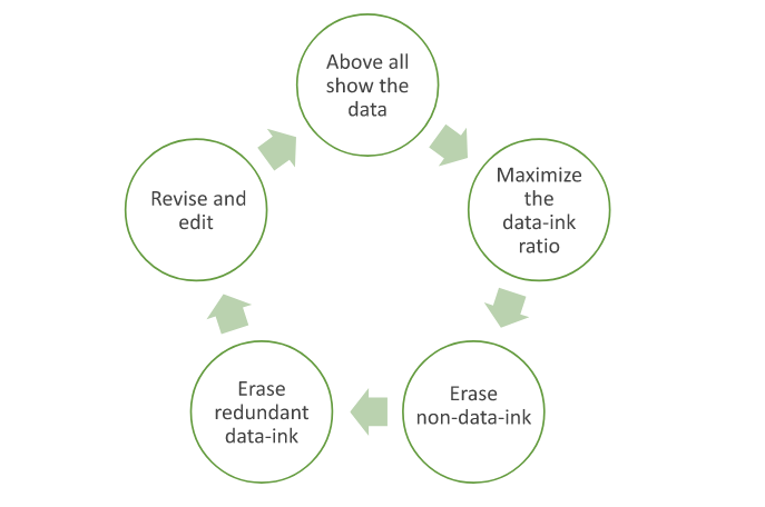
Tufte asserted this goal by articulating two erasing principles: “erase non-data-ink, within reason” and “erase redundant data-ink, within reason.” For these two types of ink, he coined the term “chartjunk.” The excessive elements to get rid of include decorations, background images, unnecessary colors, gridlines, axes, and tick marks. He said that the principles should be applied through editing and redesign. This led to the structuring of the process of data visualization as a cyclical one that ends when the most minimal output is reached.
The cycle goes as follows, in Tufte’s words:
Illustration by Islam Salahuddin
Minimalism in data visualization
Minimalism became one of the most important and influential movements during the professor’s young age in the 1960s. Minimalism is defined by Cambridge dictionary as “a style in art, design, and theater that uses the smallest range of materials and colors possible, and only very simple shapes or forms.” It is a kind of reductive abstract art that is characterized by “plain geometric configurations” that lack “any decorative… flourishes.”
That can be juxtaposed with what Tufte instructed under the data-ink ratio theory: to achieve a data visualization that is simple and, therefore, minimal. Tufte’s theory suggests that such simplicity can deliver a message that is clear, precise, and efficient. As a result, it could reduce the time required for the user to perceive the visualization.
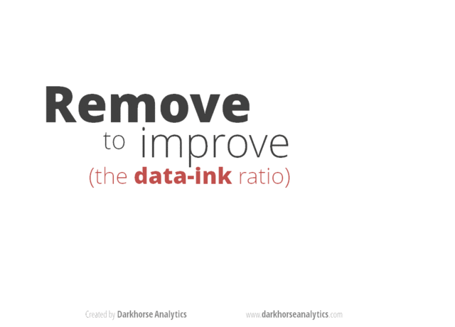
One of the many posts surfacing the internet to exemplify applying Tufte’s reductive principles on a bar chart. | Image Source: Darkhorse Analytics
Tufte’s priorities match the needs of the fast-paced business world. In business, saving time means saving cost and therefore maximizing profit. It was in the nineties, less than a decade after Tufte’s theory, when the accumulation of information started to skyrocket with the advancement of the World Wide Web. Businesspeople seemed to be lacking even more time with more information to consider, and a minimalistic approach seemed like a solution.
Minimalism did not only impact data visualization, but its effect also reached almost every corner of the human computer interaction (HCI) field. For example, as the internet became more widespread, search engines started to develop and became so powerful that they began to impose their own rules of the game. Because of the nature of how search engines work, the minimalistic structured design of web pages was more attainable for the engines to read and rank, and therefore more preferable and reachable for the audience.
For similar benefits, like reach in webpages and efficiency in data visualizations, minimalistic design became so invasive in all computer interfaces over the years. Today, minimalistic design is usually described as “modern design” and recommended to every designer building a user-interaction system, from mobile apps to webpages to data visualizations.
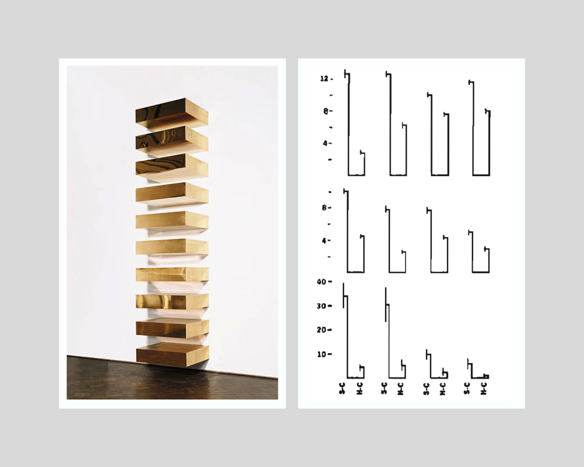
On the left: Donald Judd’s minimalist installation, Untitled, 1969 (photo from: Guggenheim Museum, New York) | On the right: Tufte’s minimalist variation of a double-bar chart with error lines. | Collage by Islam Salahuddin
Reviews of data-ink ratio’s minimalism
Despite presenting his hypotheses as proven facts, Tufte had never empirically tested his promised achievements that can be reached by minimalistic design. It was not until the beginning of the nineties that academic research started to put the claims under the microscope.
The initial research findings struggled to prove the hypotheses. However, a major multi-experiment research paper in 1994 found that some non-data-ink and redundant data-ink, especially backgrounds and tick marks on the y-axis, may decrease accuracy and increase response time (which is proportionally bad). Meanwhile, the other ink that Tufte considered to be chartjunk and called for its removal whenever possible, like axis lines, was proved to increase performance in some cases. The negative effect was clear in some chartjunk types, like axis lines, but was less certain in others, like three-dimensional charts.
Such experiments were still built on the same proposition of Tufte that graphical excellency means clarity, precision, and efficiency but found that the relationship between data-ink ratio and excellency in that sense can hardly be linear as Tufte suggests. The paper states that “effects of ink are highly conditional on the features of the graph and task” and therefore “simple rules like Tufte’s will not suffice.” Instead of indicating that all non-data-ink and redundant data-ink should be erased, the authors call on data visualization designers to determine whether the use of any ink will facilitate or interfere with reading a graph, depending on its context.
Later research even questioned Tufte’s components of graphical excellency, especially the presumed all-cases importance of response time factor. An empirical paper in 2007 found that users may prefer non-minimalistic visualizations over Tufte’s minimalistic ones, partially because they may find the latter boring. This is a criticism that both Minimalism art and statistics face and a perception that Tufte tried to avert with his rule. Boredom should not be treated as a minor problem because it means less ability to induce attention. A visualization’s ability to generate attention is the gateway to the viewer’s perception in the first place.
Attention is one of the criteria that Tufte’s rule overlooks. Other significant factors are memorability and engagement. More advanced experiments in 2013 and 2015 re-asserted chartjunk as not always harmful. In some cases, it may even increase the memorability and engagement of a visualization. Attributes like color and human recognizable shapes, icons, and images can enhance memorability due to their ability to activate more parts of a viewer’s brain, leveraging its natural tendency towards what is familiar rather than what is just minimal.
Despite their popularity, chartjunk and similar terms also appear to be highly open to interpretation among practitioners. Interpretation can be affected by an individual’s circumstances that include culture, personal style, preferences, and views, as well as constraints of skills, tools, and user’s priorities, according to a discourse analysis that was published in 2022.
On the left: Frank Stella’s minimalist painting, title not known, 1967 (photo from Tate Modern) | On the right: Tufte’s minimalist variation of a multiple vertical box and whisker plot. | Collage made by Islam Salahuddin
How to make sense of the previous discussions
The growing body of research shows that data visualization is a task that can hardly be led by only a one-factor rule like data-ink ratio. It shows that even the simple task of choosing what elements to include or exclude in a visualization remains largely an uncharted territory and needs further examination.
However, one of the common underpinnings that all theoretical works share is a consideration for the importance of context in which a visualization is designed. To be fair, even Tufte himself did not ignore this consideration after all and emphasized that certain principles have to be adopted “within reason.” Asserting the “reasonability” factor, he deliberately mentions in the Data-Ink Maximization chapter of his book that maximizing data-ink “is but a single dimension of a complex and multivariate design task.” He recognized the possible existence of factors other than excellency that come into play, including “beauty,” even if he did not prioritize them.
Therefore, synthesizing all the critiques arising against Tufte’s rule of data-ink ratio appears to be possible by quoting Tufte himself. He said that determining to which extent the data-ink ratio should be maximized rests on statistical and aesthetic criteria.” This allows data visualization designers to figure out the sweet spot where a visualization delivers what it intends to and, at the same time, does not alienize itself for the sake of being minimal.
All in all, minimalism can be considered one of the means to design a great data visualization, but not a goal. After all, the goal will remain to deliver the intended message to the audience so they can perceive it best.
Want to understand how visual representations can support the decision-making process and allow quick transmission of information? Sign up for The KPI Institute’s Data Visualization Certification course.
Edward Tufte’s principles of data-Ink ratio have prevailed in data visualization since they were introduced in the 1980s. His theory has imposed a tendency towards a minimalistic style, defining excellence as clarity, precision, and efficiency and reducing the time users perceive information.
Meanwhile, academic research that has put the American pioneering statistician’s teachings to test does not show the linear relationship between data-ink ratio and visualization’s excellency. Further research shed light on other important criteria that Tufte overlooked, like the ability of a visualization to induce attention, memorability, and engagement. Overall, the academic body of literature has strongly suggested that no simple rule like data-ink ratio can suffice in data designing.
Debates among practitioners have been ongoing about the repeated notion of “less is more,” which leans back on Tufte’s teachings. Some believe that simplicity and quick perceiving should be the goals of all visualizations at all times. Others support embracing complexity and slow viewing time in some circumstances.
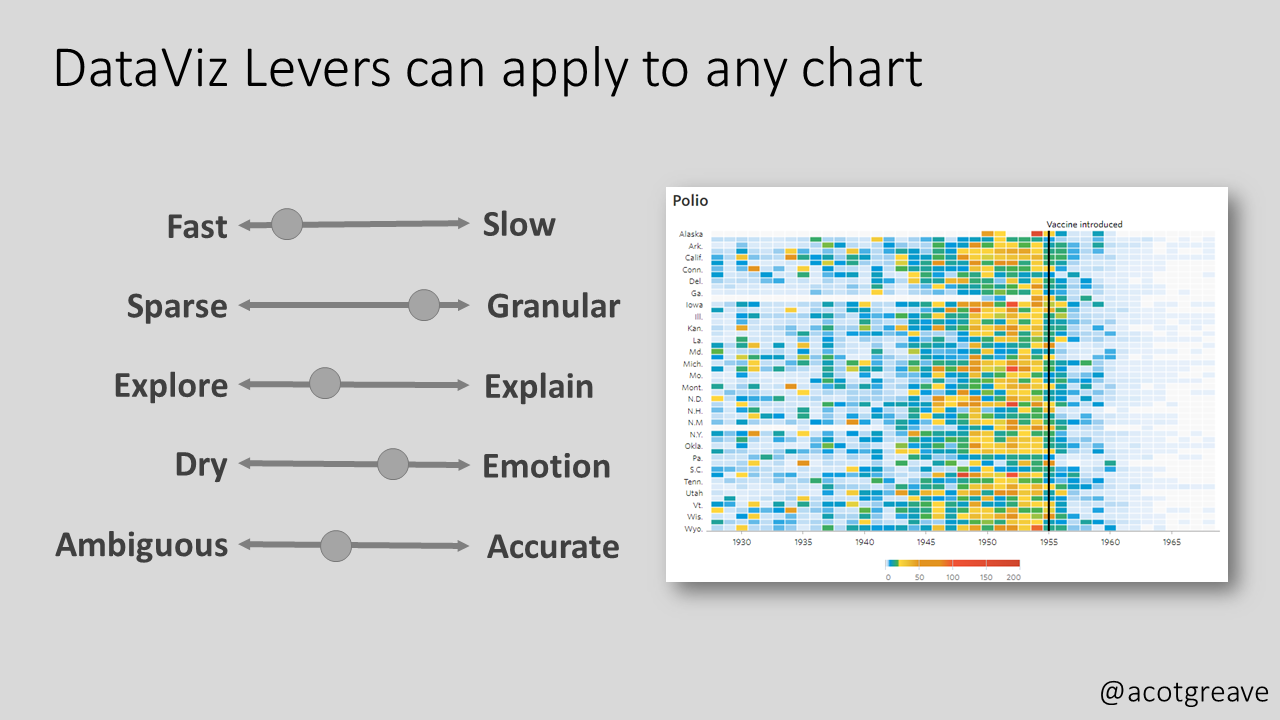
As a response to these debates, two interesting frameworks have emerged to suggest more criteria that should be considered. The first is “Levers of Chart-Making” by Andy Cotgreave, a senior data evangelist at Tableau, and the second is “Cognitive Load as a Guide” by Eva Sibinga and Erin Waldron, data science and visualization specialists.
Cotgreave suggested this under-formulation framework in the November 2022 edition of his newsletter The Sweet Spot. He put forward five scales of levers that “chart producers can use to enlighten, not bamboozle.” They are as follows:
Speed to primary insight – How fast or slow insight is intended to be extracted from a graph According to him, “it is ok to make charts that take time to understand”.
Granularity – How sparse or granular is the data that a chart intends to show?
Explore or explain – whether a visualization is intended to give the users the opportunity to explore the data themselves (like self-service dashboards) or to be accompanied by an explaining presentation
Dry or emotional – refers to how serious the way of presenting the data is versus how informal and relevant it is to non-data people. According to Cotgreave, an example of the serious approach is a normal column chart and for the emotional, a necklace of which the bead’s size represents the same underlying data.
Ambiguity vs. accuracy – For Cotgreave, there can be intended ambiguity in chart-making instead of clear accuracy.
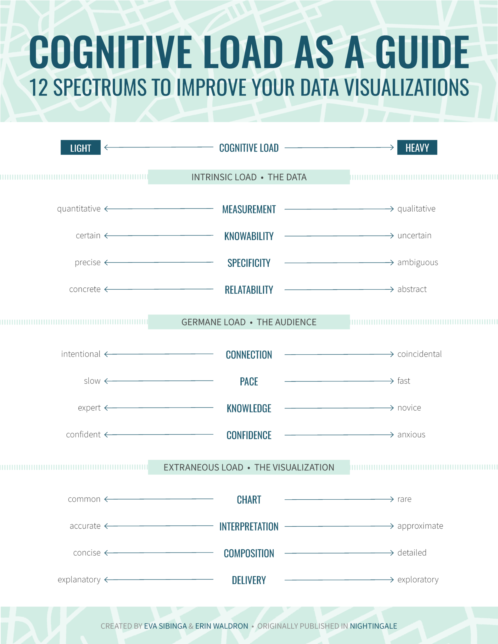
Cognitive load is a more detailed and rigid framework that takes its inspiration from the psychology of instructional design. Suggested by Sibinga and Waldron, the framework was published by the Journal of the Data Visualization Society (Nightingale) in September 2021.
Cognitive load proposes 12 spectra, offering “an alternative to one-size-fits-all rules” and aiming to “encourage a more nuanced strategy” for data visualization. Divided into three categories, the spectra are supposed to “gauge the complexity of our data on one side, identify the needs of our audience on the other, and then calibrate our visualization to successfully bridge the gap between the two.”
Intrinsic load – This is the first group of spectra that is concerned with the data itself. It considers the inherent level of complexity in the data that a designer is tasked to explain with a visualization. The included spectra are:
Measurement (quantitative vs. qualitative) – According to the authors, quantitative data has less cognitive load (easier to perceive) than qualitative data. That is because the former usually has obvious measuring units, like dollars or miles, while the latter usually needs a conceptual rating scale, like satisfaction rate from 1 to 5.
Knowability (certain vs. uncertain) – Data collected from the whole population is easier to perceive than data estimated depending on a sample or predicted for the future. This is because the former usually has a high level of certainty that is easier to perceive than the uncertainty that comes with the latter, intertwined with its inevitable statistical margins of error.
Specificity (precise vs. ambiguous) – Undebated data categories, like blood type or zip codes, tend to be easier to perceive than socially determined concepts, like gender, race, and social class.
Relatability (concrete vs. abstract) – How relatable is the data to what humans see in everyday life? Concrete data would be small numbers like the cost of lunch and one’s age, while abstract data would be conceptual ones like GDP and the age of the earth.
Germane load – The second group of spectra is concerned with the audience and how ready they are to process the new information shown by a visualization. The included spectra are:
Connection (intentional vs. coincidental) – How will the audience have the first look at the visualization? Intentional viewers are likely better propped to perceive the visualization than viewers who stumble upon it by accident.
Pace (slow vs. fast) – Slow viewers are the ones that have more time in hand and therefore +have more ability to perceive a visualization (interpreting into lighter cognitive load).
Knowledge (expert vs. novice) – Expert viewers are the ones who are already familiar with the subject and therefore will have to afford lighter cognitive load when viewing a visualization.
Confidence (confident vs. anxious) – This spectrum addresses the intersection of the audience and the data reporting format. The cognitive load that is required from an audience familiar with the data reporting format, such as an interactive dashboard and a data-based report, will require lighter cognitive load than the one that is encountering such a channel for the first time.
Extraneous load – The final group addresses how new information is presented. The authors believe that these are the criteria where a designer has the most control and should therefore be considered last. The advice to determine a visualization’s place on the following spectra is by answering the question: “Given the existing intrinsic and germane loads, how much more cognitive load are we comfortable adding to the mix?”
Chart type (common vs. rare) – Chart types like bar charts need lighter cognitive load than uncommon ones, like violin charts or rose diagrams and the more innovative ones.
Interpretation (accurate vs. approximate) – Does the chart aim to deliver precise values or paint a wide picture? According to the authors, charts delivering specific values tend to take a lighter cognitive load than the ones dealing with overall objectives.
Composition (concise vs. detailed) – This spectrum assumes a high data-ink ratio and no chartjunk (from Tufte’s concepts) are already in place and then asks, how dense is the information on the page? Less dense visualizations require lighter cognitive load.
Delivery (explanatory vs. exploratory) – Does the data report explain itself, or is built to be explored? Exploration, naturally, takes more cognitive load than a self-explaining visualization.
How to make sense of all the previous discussions
Levers of chart-making and cognitive load as a guide are two of the recently suggested frameworks that offer a more complex approach to the task of data visualization. The two have similarities, like their consideration of complexity, granularity, and way of delivery. They differ from Tufte’s approach mainly through their acceptance of the need to slowly perceive designs in some circumstances. Cognitive load still deliberately pre-assumes applying data-ink ratio principles beforehand.
Therefore, no framework is likely to totally replace the others. At best, they tend to complement each other to cover the vast territory of the data visualization domain.
Data-ink ratio principles remain a good point to start as it best fits most business contexts. It can also help designers keep in mind the point of their design and avoid getting distracted amidst all the available software tools today. However, considering the emerging frameworks can make the practice more nuanced for tackling different needs, messages, and audiences.
The final determinant of how to incorporate the three frameworks -and any other emerging ones- in practice will remain to be the context of the visualization. A better understanding of the audience, the message, and the medium is key before using the different frameworks to decide on how information should be delivered.
Want to understand how visual representations can support the decision-making process and allow quick transmission of information? Sign up for The KPI Institute’s Data Visualization Certification course.