
Data visualization: Standardizing background data
Crafting a visualization is more than simply translating a table of information into a visual display. Data visualization ought to communicate information in the most effective way, with the prime purpose of truly revealing data in a quick, accurate, powerful and long-lasting manner. Representative visuals can easily summarize and communicate data to other people, making even the largest or most complicated sets of data understandable.
There are virtually limitless ways and methods of creating visualizations, as they varies greatly depending on the content itself but also on the purpose. But regardless of what shape or form a visual takes, the most important is to maintain graphical excellence, expressed by Edward Tufte as complex ideas transmitted with clarity, accuracy, and efficiency.
According to Edward Tufte’s checklist, all data visualizations should:
- Most importantly show the data;
- Don’t distort the data and be accurate;
- Convert large data sets into comprehensible sets;
- Provide a clear purpose;
- Present the information at different levels (a matter of overview versus detailed)
- Determine the user to compare various pieces of data.
Continuing on Tufte’s trail of though, Ben Fry offers other guidelines that should be taken into consideration when crafting visuals:
- Acquire: Obtaining the data, regardless whether it is from a file, or on a disk or from a network source;
- Parse: Providing structure for the information’s meaning, and it should also be ordered into categories;
- Filter: Removing every piece of information except the data of interest for us;
- Mine: Applying various methods used in data mining or statistics as a method to identify patterns or the data should be placed in a mathematical context;
- Represent: Choosing a general and simple visualization, such as a bar chart, list or tree;
- Refine: Improving the simple visual to make it more clear and more engaging to the viewer visually;
- Interact: Adding identifiable methods of data manipulation or feature control.
According to Ben Fry, when dealing with complex sets of data, the cooperation between many disciplines is needed as to provide a significant understanding of the data. Therefore, fields such as data mining, statistics, information visualization and graphic design should be taken into consideration when handling thousands or even tens of thousands of data sets.
Nonetheless, regardless of where the data is originating, every set of data can be in various ways visualized, some are more efficiently than other methods. Therefore, the first stage in forging a visual representation is to comprehend the raw data in hand. One might consider answering some basic questions beforehand:
- What is the purpose of the data and what does the it represent?
- Can any relationships between variables be identified? If so, which are they?
- Is the data in anyway organized? Does it have any structure or categories?
- In the end, which information is required to be communicated?
Answering these questions but not only provides a starting point in crafting a visual representation and helps in determining the final form. One of the most important aspects is understanding how the data is structured and how each set relates to each other. There is a major difference between communicating the growth rate of a company over a period of time, where a simple line chart might suffice, and when visualizing a 250 million dollar investment in a new wind turbine production and installation facility in a limited space, where an infographic might prove more efficient.
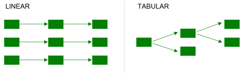
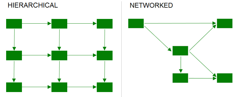
As stated before, there are limitless possibilities as to how one can visualize data. Therefore, an important role in the outcome of the visualization is played by the background data. There are many existing design patterns that have proven to be efficient for specific sets of data. Some examples are presented below.
Given that the raw data may be differently interpreted based on both the internal comprehension of a person and the collective representational conventions the finished visual embodies, a key aspect is to insist on a thorough standardization of the information. Part of a broader shift in science is an effective data visualization where information is easily accessible, standards and tools for standardization are widely available, and high-quality visualizations are easy to produce and distribute.
References:
- Tufte, E. (2001), The visual display of quantitative information
- Fry, B. (2007), Visualizing data: exploring and explaining data with the processing environment
- Department of energy and climate change and The Rt Hon Edward Davey MP (2014), Siemens to build major offshore wind manufacturing site in the UK
Tags: Data Visualization