Data visualization – 5 DON’Ts
Data visualization is an important part in reporting performance, as it can enhance a fast and clear understanding of the situation. However, poorly designed graphs can create confusion. The best way to reflect results is to keep the graphic representations as simple as possible and to provide the most relevant information for the reader.
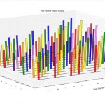
1. Avoid 3D graphs

Looking at the graph from above it is difficult to read the values or to seize the small differences between bars. 3D makes it hard for the human eye to perceive the right size of objects.
2. Avoid pie charts

Pie charts have been over used in the past years and they may not be the best way to illustrate data. Pies can be hard to read, especially if the data is granular and generates many slices.
3. Do not use bars to represent trends

Bars are not the best option to represent evolution from one year to another. A line chart would be more suitable. Furthermore, graphs should be kept simple and given the example above, the line chart should be represented as a single graph.
4. Don’t avoid colors, but don’t abuse of color contrast


Not using colors makes it hard to read the graph, but the combination of colors shouldn’t be too strong. Strong contrast is tiring for the eyes and may distract attention from what is really important.
5. Don’t put too much data in one graph

In some cases it is recommended to have more than one graph to represent the data. Representing three or four evolution lines should be enough in one chart. People won’t manage to extract the relevant information from a crowded graph.
The purpose of visual representations is to transmit a message and without a smart design they become inefficient tools. Acknowledging some of the frequent mistakes is the first step to improve data visualization.
References:
- MIDA (2012), Malaysia investment performance 2012
- Netflix (2012), Netflix content delivery
- CPDS (n.d.), Understanding Water Supplies in SEQ
Image Sources:
- Malaysian Investment Development Authority Performance Report 2012
- Netflix UKNOF – Q1 2012
- CPDS
- design you trust
Tags: Data Visualization, Guidelines, Theory