Reporting performance – 5 guidelines
Performance reporting is no longer just a legal regulation for companies, as it has become an instrument to improve brand image through transparency and by showing interest not only in the financial area, but also towards employees, environment and community.
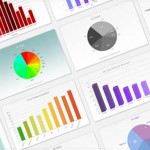
As there is a variety of visual representations and colors that can be used to display the results of KPIs, it is important to acknowledge that in order to keep data visualization efficient certain rules should be respected.
- Use the adequate graph

It is very important that the data is represented in an adequate graph:
- Use line graphs for trends
- Use bar charts to compare individual values
- Use scatter graph to track relationships
2. Keep the background of the graph simple

Contrast colors can make the graph disturbing, if the color combination is not appropriate. A white background or with discrete grids is the best option.
3. For more data, use more than one graph

Putting to much data in one graph make it a lot harder to read and extract the relevant information. Data can also be compared by placing together two graphs.
4. The graphs should be accompanied by comments

Writing comments next to the graphs makes it really easy for the reader to understand the evolution of the KPI and eliminates the risk of wrong assumptions in regards to what generated the results displayed.
5. Performance can be reported also using less traditional graphs such as gauges of infographics

Gauges illustrate very clearly how much of the targets proposed was achieved and if the current situation is unacceptable (“red”), acceptable (“yellow”) or as desired (“green”). The advantage is that it indicates instantly the type of action that needs to be taken.

Infographics are very popular as they present the information in a very attractive format. The variety of colors and shapes gets the attention of the reader and the message is a lot easier to receive.
Regardless of the type of visual representation used, it is important to present the information in a format that is easy to understand and makes data visualization efficient.
References:
- BBA Aviation (2012), Annual report 2011
- U.S. General Services Administration (2013), Governmentwide acquisition contract dashboard
- U.S. Department of Agriculture (2013), Dashboard
- Virginia Department of Transportation (2007), Dashboard
- Coolinfographics.com (2013), Pepsico Q2 2013 performance
Image sources: