The structure of a high performing landing page
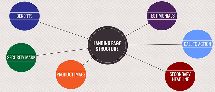
In the previous articles about Online Audience Optimization, we discussed online strategy, the mobile user’s perspective and how to increase website performance. Now I think it’s time for a better picture of how to create a high performing landing page.
What does a high performing landing page mean? Essentially, it’s a webpage that has a higher visitor-to-customer conversion rate, compared to a normal web page.
Before starting to discuss about the structure of a landing page I want to clearly specify that the homepage and the landing page are two very different things. The main purpose of the landing page is to generate conversions and the main purpose of a homepage is to better understand what a company offers, does, and so on.
Having a high performing landing page equates to reining in more and more customers, which has a subsequent positive impact on the overall performance. So, let’s break it down into its elements and see what performance drivers need to be addressed.
1. The landing page headline
The headline of the page should contain the name of the product and should use approximately the same words as in the advertisement campaign in a clear and concise way.
The headline is the only intermediate element between the Ad text from the AdWords (service provided by search engines for SEM) and the landing page.
2. The secondary headline
It should include a one phrase description of the product available for sale on the landing page. Why should it contain this phrase? Because at this point we, as webmasters, try to create engagement between the user and our webpage. Hence, the object we want marketed needs to be clear.
3. The image / video of the product
It is very important to have a representative image that best showcases the product you are selling. According to the 2014 trends in web design, the picture that describes the products should be changed with descriptive videos, because it facilitates users’ understanding of what exactly the product’s features are. Also, it becomes easier for a webmaster to describe a product.
4. Testimonial section
From my point of view, I think this is one of the most important elements of a landing page, because it offers you a part of the buying experience and gives you a sense of other customers’ experience. It is like an opinion exchange between customers and potential customers. Related to the offline buying process, this part is very similar to the part where, post-purchase, you become a promoter for a product and share all its good features with your friends and your circle of interest.
5. Call to action button
A lot of webmasters that design a webpage forget the importance of the call to action buttons. It is kind of usual to think that after you describe your products, users will more likely buy the product in accordance with their needs and with the quality of the description. However, without a call to action button the conversion rate will be a lot lower, down to even 100% lower. Another good tip about the call to action button is to make it a little bigger than the other buttons and color it in contrast with the webpage theme’s color.
6. Security marks / badges
Even if we are in 2014, and a lot of people buy online, there is still a trust issue regarding payment security for sites that do not have a well-known brand. In order to reduce the percentage of users that don’t trust the payment security of your site, it is recommended to post the security system’s badge in clear sight, to reinforce the feeling of safety and ward off skepticism.
7. The benefits provided by the product / service
I strongly recommend writing 3-5 concise lines that highlight the benefits of using your product or service. When trying to create this section, think from the user’s perspective and try to understand why they are going to buy your product / service. A common mistake is to not be capable of thinking from the user’s perspective and to outline the benefits you think the users sees in your product / service. To ensure a better quality of this section, I recommend sending a survey throughout your customer base and understanding exactly what they think are the benefits. This option may involve some costs but they’re worth it, because you can also obtain testimonials, opinions and ideas about what to improve in your products / services, and so on.
These 7 elements are the crucial elements of a high performing landing page, which will guarantee a high rate visitor-to-customer conversion.
A final thought, when you are trying to create a landing page, keep in mind not to add more elements of any kind to it, be they content or design related. Just 1-2 more elements, if you think it’s really necessary, because there is a fine line between a crowded landing page and a well-developed one.
Remember to keep efficiency in mind, an eye on the user’s perspective and the overall high performance goal in sight and you have all the makings for a successful, highly effective landing page.
Mihai Păculea. Business Research Analyst, The KPI Institute
Tags: Online Audience Optimization, Online Presence - eCommerce performance, Online strategy


best university Egypt
| #
best university Egypt
[…]we came across a cool website which you may well love. Take a search for those who want[…]
Reply
FiverrEarn
| #
FiverrEarn
[…]Here are some of the web-sites we suggest for our visitors[…]
Reply
uno online
| #
I really like the entertaining game Uno online, you can try it whenever you have free time with your friends!
Reply