The term “high-performance” implies that the team’s performance is measured and either meets or exceeds expectations. Thus, for organizations seeking objective measurement and the precision necessary for informed decision-making, having a strong data analytics framework is indispensable. One of the most practical applications of this is the use of key performance indicators (KPI) dashboards to track progress and align efforts.
Before developing a KPI dashboard, it is important for organizations to first understand how goals are set, including the processes, roles, and considerations involved, as these form the foundation for effective measurement and improvement.
Analytical Goal Setting
Step 1: Defining High Performance
The first step to achieving high performance is to define it. This is done by setting specific objectives for your company, team, and team members. This process is usually top-down for most businesses, meaning top management defines the company-wide goals first and then cascades them down the totem pole.
Let’s take a small marketing consultancy firm as an example. The firm’s top management may define high performance as achieving a 10% year-over-year growth in revenue. Achieving this target means the company is high-performing.
Step 2: Identifying Key Processes
At this point, everyone in the company should already understand what management sees as high performance. However, what does high performance mean for individual teams? They must understand what they can specifically do to help the company achieve high performance.
Let’s continue with our marketing consultancy example. If the company aims to achieve 10% year-over-year growth in revenue, here is how each department can contribute to this goal.
The marketing team can work on increasing the number of generated leads.
The sales team might implement new strategies to upsell current and old clients. They can also train the salespeople to increase the conversion rate of leads into customers.
The finance team can collect invoices from customers faster, leading to higher reported revenue and lower bad debt.
The client services team can work on increasing customer satisfaction, therefore retaining clients for longer.
If every team member understands which of the processes they can influence, then they can all work together to achieve high performance. This clarity around goals and processes forms a critical part of the overall data analytics framework, ensuring that every metric tracked later truly reflects business priorities.
It can be tempting to set targets for each team member related to every process. However, achieving high performance does not come from setting aggressive targets alone. This is something that Richard Rumelt talks about in his book Good Strategy/Bad Strategy. In the book, he states that growth targets should be justified by:
A wider industry growth
A new product/service that a company launches
An improvement in a current business process
New source of leads
For example, before the sales team commits to a 10% year-over-year increase in sales to existing clients, management should decide what exactly will contribute to this growth:
Is this in line with the wider industry trend? If so, management should define specific strategies for how the sales team could capitalize on it.
Did the company launch a new product? If so, management can work together with the sales team to identify new upsell opportunities.
Does the sales team need more capacity for the sales process? If so, management can hire an additional salesperson.
Are there any salespeople who have better conversion rates than others? If so, management can train the other salespeople based on the best practices of high achievers.
Essentially, the whole team needs to agree on what specifically would drive business growth. Once this is done, management will be able to identify specific tasks and start assigning them to team members.
Data Analytics
Step 4: Determining KPIs
Once the process is identified and broken down into tasks, there are two types of key performance indicators (KPIs) that the team needs to measure:
How tasks are being completed
The output of the process
For example, here are the KPIs that measure how effectively the sales team is following the process:
# Prospecting calls to existing clients per month
% Clients contacted with new offers
# Demos to existing clients
Measuring and tracking the team’s performance based on these KPIs can help identify any potential problems in the execution process.
The company should also identify KPIs that measure whether the new process is productive, such as:
# Sales closed
$ Additional revenue
% Conversion rate from prospecting calls to demos
These KPIs can help the company understand if the process is bringing the desired results to the business. If not, the company may need to re-engineer the process or pivot toward a different one altogether.
The final step is to set targets based on every KPI. This will set performance expectations for every team member and ensure clarity on how their performance is measured.
Step 5: Developing KPI Dashboards
KPI dashboards help management keep their finger on the pulse of the company by providing the latest updates based on identified KPIs. The process of building these KPI dashboards involves:
Extracting the data needed to calculate these KPIs
Visualizing this data by using business intelligence (BI) services like Power BI or Tableau
Refreshing the data in these dashboards either manually or automatically
Using BI tools to build KPI dashboards enables businesses to automate their reporting process, which makes it easy to refresh the dashboards every day. By having almost real-time reporting, management can quickly identify if the process needs to be optimized and which part of the process is responsible for underperformance.
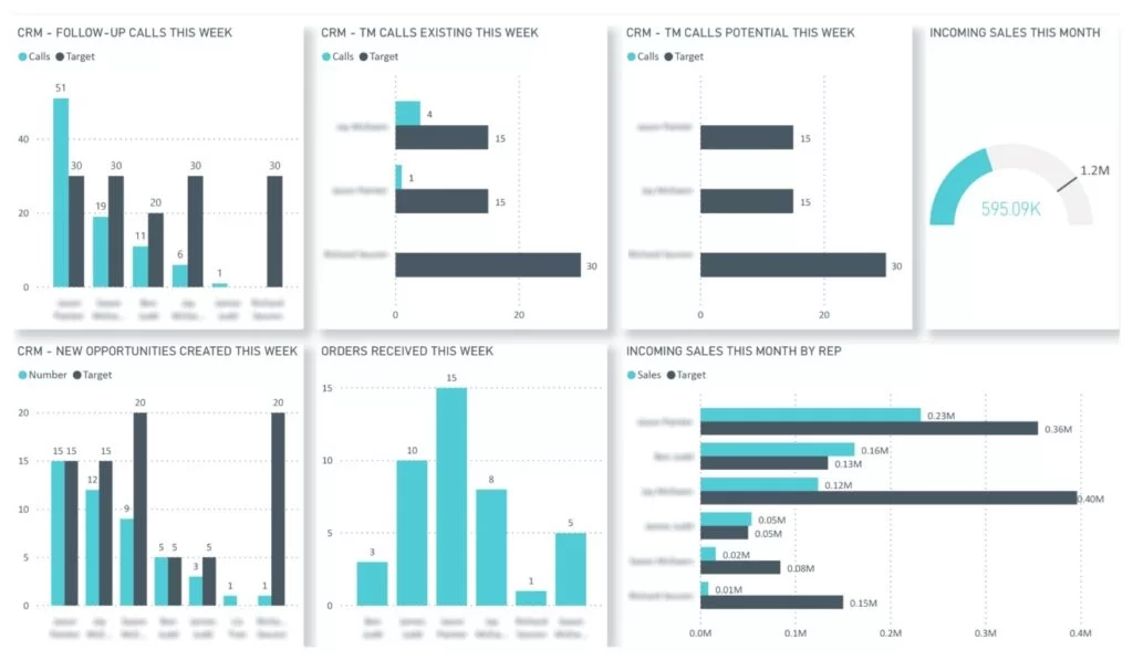
For example, the CRM KPI dashboard (see Figure 1) analyzes the performance of every sales representative within a team based on their activity metrics. Notice how there are targets for every sales activity KPI and for each team member.
Many companies also choose to share these KPI dashboards with every team member so that everyone knows their performance and how it compares with others in the team.
Sharing KPI dashboards with the whole team is impactful for several reasons:
Every employee understands which KPIs are used to measure their performance.
Everyone is clear at all times whether they are on track to hit their targets.
Team managers can identify high performers and team members who need the most help.
However, creating data analytics reports alone is not going to drive high performance. Data analytics reports simply improve the management of business processes, which can lead to higher performance.
It is also important to note that working to achieve certain targets can be quite stressful for the team. A good practice is for management to take a helpful stance on achieving targets by supporting team members when they need it, instead of putting more pressure on them when their performance lags.
**********
Editor’s Note: This article was written by Eugene Lebedev, managing director of Vidi Corp, a UK-based data analytics consultancy. He has delivered over 1000 data analytics solutions for more than 600 international clients, including Google, Teleperformance, and Delta Air Lines.
Big data has created unrivaled opportunities for businesses. It aids them in achieving faster and deeper insights that can strengthen the decision-making process and improve customer experience. It can also accelerate the speed of innovation to give companies a competitive advantage. Given that we live in a time of data and information overload, we really need to have better mechanisms to make sense of it all. Enter data visualization, which supports the transfer of information to knowledge by illustrating hidden issues and opportunities in big data sets.
A significant amount of the human brain is dedicated to visual processing. This results in our sight having a sharpness of perception far surpassing our other senses. Effective data visualization shifts the balance between perception and cognition. The visual cortex is used at a higher capacity, and the viewer understands the presented information much quicker to make better decisions based on the findings.
Businesses are increasingly turning to data visualization to organize the overwhelming amount and variety of data cascading into their operations and to eliminate the struggle of just storing the data, shifting instead to analyzing, interpreting, and presenting it in a meaningful way. The trend toward data visualization is worth delving into by any business seeking to derive more value from big data.
Tackling big data usually involves the four Vs: volume, velocity, variety, and veracity. However, we must emphasize a fifth V that requires attention, namely visualization. Even with the use of business intelligence (BI) tools and the exponential increase in computing power, the need to consume information in a meaningful manner exceeds the ability to process it.
Visualization plays a key role starting from the raw input of big data, where structures and underlying patterns that may be held within the data can be observed or formed, resulting in a visual representation that presents key insights in an efficient and digestible way.
Crafting data visualization is more than simply translating information in a visual display. It ought to communicate information effectively, with the prime purpose of presenting data in a quick, accurate, powerful, and long-lasting manner.
The main problem with big data involves complexity. Data is growing exponentially with time, as an increasing amount of it is made available on the internet. Furthermore, the number of insights, opportunities or hypotheses hidden in a dataset is exponential to the size of the datasets.
Key performance indicators (KPIs) can be used to achieve efficiency and ensure the comprehensibility of visual representations resulting from big data, attain the goal of graphical excellence, and add value to the result. Big data visualization requires skills and principles that must be carefully learned. Each big data visualization created should follow a clear path to success: attain, define, structure, extract, load, display, refine the data, and interact with it.
KPIs add value to the entire process by ensuring clarity in developing the strategy of the project, focus on what matters and requires attention, as well as improvement by monitoring the progress towards the desired state.
When developing a big data visualization project, the process should follow a cursive and pre-defined flow in accordance with the project needs and the requirements of the end-user. These recommended stages are:
Acquiring the Data
This is usually how the process starts, unrelated to the platform that provides the data. In the process of big data collection, there is also the issue of data selection. Instead of just throwing it all in, one should focus on selecting high-quality data that is relevant to the project’s objective and does not add noise to the end result.
The noisier the data is, the more difficult it will be to see the important trends. It is suggested to have a clear strategy for the data sources required, as well as for the subsets of data relevant to the questions the project wants to answer.
Structuring the Data
The next phase in the process is structuring the acquired data. This includes the process of organizing the data to align it to one standard. The data store might be comprised of a combination of structured, semi-structured, and unstructured data.
At this stage, it is easier to identify the common aspects in each set of data and to find relationships between the data at hand. This includes translating system-specific data coding to meaningful and usable data (the platform where the data will be aggregated does not know that the set of data labeled “Customer No.” is the same as “# Customer” or “ID-Customer”).
Loading and Visual Mode Selection
After cleaning the data, filtering through enormous amounts of data, and replicating the application logic to make the data self-describing, the process continues with loading the data in the preferred platform and choosing the visual mode of representation.
In this stage, we can determine if the background data is very noisy, as the emerging visual representation will be hard to read or irrelevant to the strategic objective of the project.
By implementing KPIs along the project and linking them to the project objectives, the increased value will be added in the form of:
Better quality of the visual representations
Fewer project delays
Less rework along the way
Improved productivity
Greater contribution to the visuals’ value
Enhanced growth and innovation of the visual representation
As dashboards, performance reports, and meeting invitations are piling up, a decision must be made or a strategy needs to be developed. This typical workplace scenario can be overwhelming and can make people fixated on numbers. Unfortunately, organizations sometimes heavily rely on such figures to make decisions that prioritize the company’s interests over those of people and the planet. To ensure that a company’s approach to performance reporting and strategic decision-making remains effective and holistic, it is important to understand the different statistical factors causing inaccuracy and inconsistency.
1.Weighted performance scores
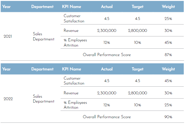
Setting priorities and focusing on what matters by correlating importance with a weighted value will definitely facilitate the performance reporting process and is integral to calculating an overall performance score. However, according to The KPI Institute, establishing weight could be subjective and misleading if one is not careful about how to report it because changing weights from one period to another leads to inconsistency of data in time and creates a fallacy of performance improvement or regression.
For example, a report could be presented to the management regarding the improvement in the performance of the sales department from the year 2021 to the year 2022 and that the department performance score has improved by 4%. However, there is a possibility that their performance has not changed at all if all they have done was change the weight of the underperforming key performance indicators (KPIs) to get different results.
To avoid such a misleading presentation, it is important to redirect the conversation to the metrics’ results and not the weighted score or the target. This will drive the decision-maker to concentrate on what matters and see the bigger picture.
Figure 1. Sales department’s performance in 2022 and 2021
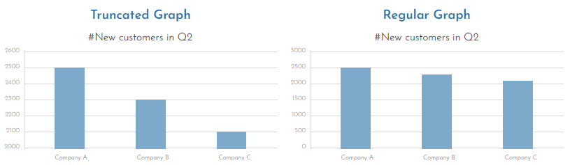
Arguably, the most common form of misrepresentation in graphs is when its Y-axis is manipulated to exaggerate the differences between bars. The truncated graph is produced when the axis starts from a value other than zero. This might give an illusion that the differences are high.
Even if the audience is informed that the Y-axis was truncated, a study found that they still overestimate the actual differences, and the results are often substantial.
Start the axis at zero to show the true context of the data. This will ensure that the data is presented naturally and accurately, reducing the chances of being misinterpreted.
Figure 2. The differences between a regular graph and a truncated graph
3. Small sample size
Darrell Huff, the author of “How to Lie with Statistics”, believed that samples can be trusted only if they are statistically significant. Hence, to be worth much more, a report or analysis based on sampling must use a representative sample, and for it to be relevant, every source of bias must be removed.
For example, a skincare company might advertise its facial wash by putting “users report 85% less skin breakout” on its packages. Upon closer inspection, one may discover that the test group of users consisted of only 15 people. This sample size works well for the skincare company because it is easier to repeat the experiment in a smaller group until they get their desired result while ignoring any findings that do not support how they want to promote their product. Sooner or later, a focus group will show a significant improvement worthy of a headline, and an advertising campaign based on a deceiving result will be created.
There is no clear-cut answer on what the appropriate sample size is since it will be highly dependent on the research type and population size, and there are many statistical methods and equations that could help determine the appropriate sample size, such as Herbert Arkin’s formula or Krejcie and Morgan Table. In addition, when reporting the survey or research results, it’s important to be transparent with the recipient audience and communicate the survey methodology, population, and the logic behind determining the sample size.
4. Misleading averages
While averages can give a simple summary of large data, they might also give half-truths. Case in point, if the range between numbers is too high, then the average would be meaningless. It is optimal that when an average is presented in data, it should be introduced along with supporting facts to provide in-depth analysis and make the right decision at the right time for the business. It is, therefore, important not just to rely on an average but also to look at the distribution of data, understand the range, and consider other statistical measures like median and mode. The median represents central tendency measurements instead of the average or mean because it is less impacted by outliers.
To conclude, it’s crucial for all stakeholders—whether they’re performance specialists or executives at the top management—to understand how human biases can infiltrate numbers and form a narrative that is completely different from reality. This can be avoided by ensuring that the reported data covers all the quality aspects of completeness, uniqueness, conformity, consistency, and timeliness. In addition, organizations must establish a data validation process to ensure the credence of performance reports.
**********
About the Guest Expert:Wedad Alsubaie, a seasoned Senior Strategy Management Officer at the National Unified Procurement Company (NUPCO), holds certifications in strategic business planning and KPI and performance management. With extensive experience in enhancing corporate and individual performance, she led the performance development program in Mobily and is now focused on corporate strategy and performance management at NUPCO.
Editor’s Note: This was originally published in Performance Magazine Issue No. 29, 2024 – Strategy Management Edition.
Isn’t it fascinating how charts can dissolve divides and turn disconnect into discoveries? It’s a purposeful medium where even the fragments and imbalance in the world are always part of the story. By unifying or restructuring grand and small narratives in a more distilled expression, charts make complex truths accessible to a wider audience. Consequently, the audience become not just spectators but also collaborators, peeling meaning from their respective perspectives or contributing to a common understanding. However, producing charts with this level of effectiveness doesn’t just happen through the mere union of analysis and aesthetics.
It starts with choosing the right chart for your data. That choice should be driven by intuitive wisdom and structured control, and both are anchored on purpose. By defining what you need to bring out of the data, you eliminate the unessential and get your message across as quickly and as clearly as possible.
What’s Your Purpose?
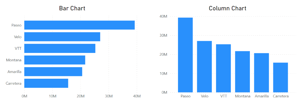
Comparison is a common purpose for data visualization, and the bar chart is the tool to make this happen. Bar charts use one categorical variable and one numerical variable like income data across departments. For more nuanced comparisons, clustered bar charts can be used to introduce another categorical variable, like seniority levels within departments. Bar charts, as shown in Figure 1, have horizontal bars, while another type, the column chart, uses vertical bars.
Figure 1. A bar chart (left) and a column chart (right) | Image Source: Financial Edge
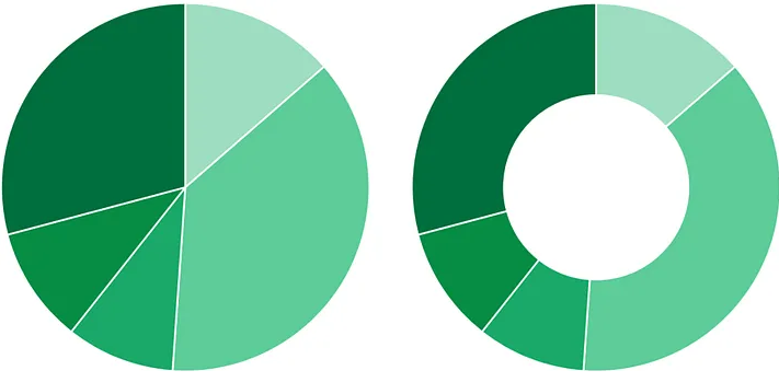
Another purpose for data visualization is to show composition, specifically the contribution of parts to a whole. This type of visualization generally involves one categorical variable and one numerical variable. Composition charts in a matched pair usually take the form of a pie chart or donut chart (see Figure 2). An example of what they can demonstrate is the percentage of customers who prefer one product over another.
Figure 1: A pie chart (left) and a donut chart (right) | Image Source: Medium
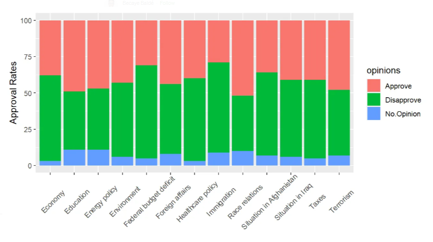
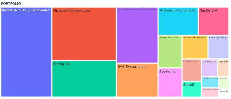
More complex data with multiple categorical variables will benefit more from using stackedbar charts, which are similar to bar charts butwith multiple categorical variables represented as additional parts stacked alongside each other (see Figure 3). Alternatively, complex data can be illustrated using a treemap, which involves dividing a rectangular area into smaller rectangles to represent hierarchical data such as income distribution across regions and cities (see Figure 4).
Figure 3. A stacked bar chart | Image Source: Medium
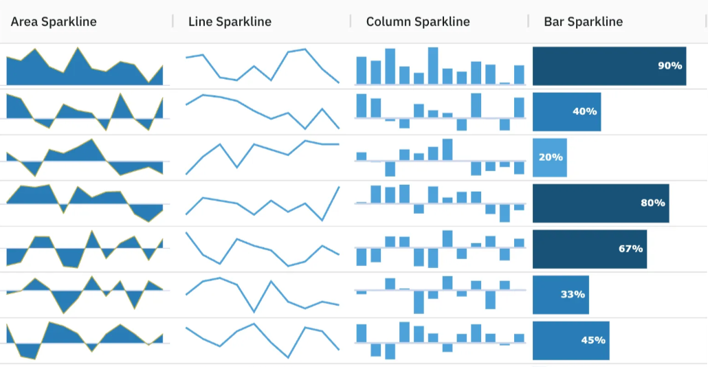
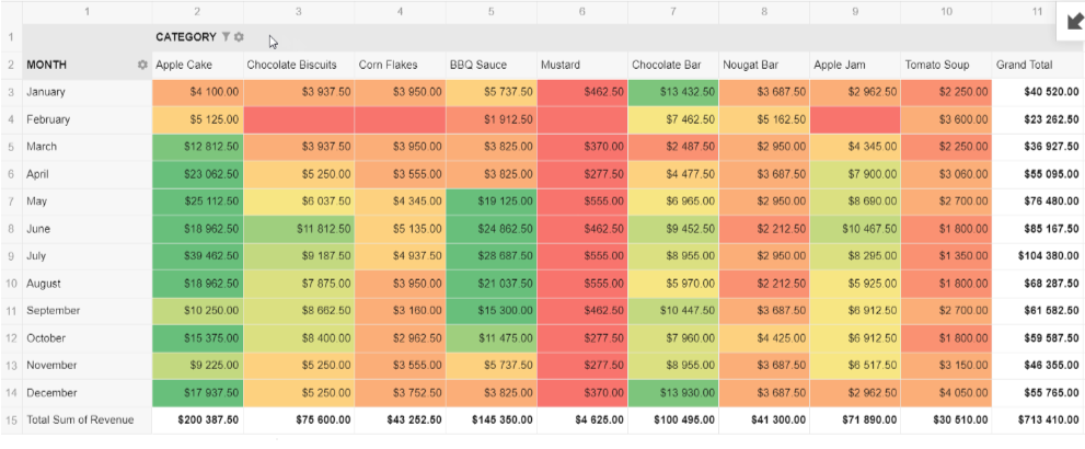
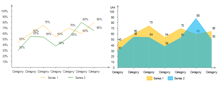
If your purpose is to show change over time in charts, it can be done with line charts or area charts (see Figure 5). The line chart works better when it comes to a numerical variable with a time series, such as monthly revenue. The continuity of the line allows the viewer’s eye to easily notice trends and changes over time. The area chart goes one step further by shading the area under the line, emphasizing both the change and its magnitude. For more compact visualizations within tables, sparklines can be used. These are small charts that may be placed in a sheet’s individual cells and can highlight trends in big data sets or point out maximum and minimum values (see Figure 6).
Figure 5. A line chart (left) and an area chart (right) | Image Source: Edraw
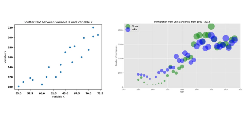
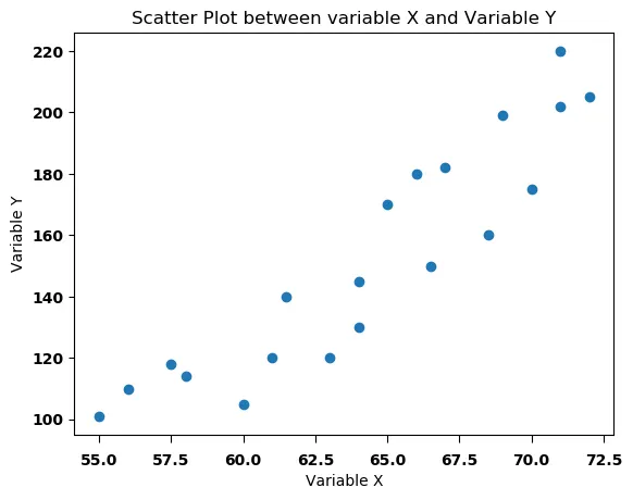
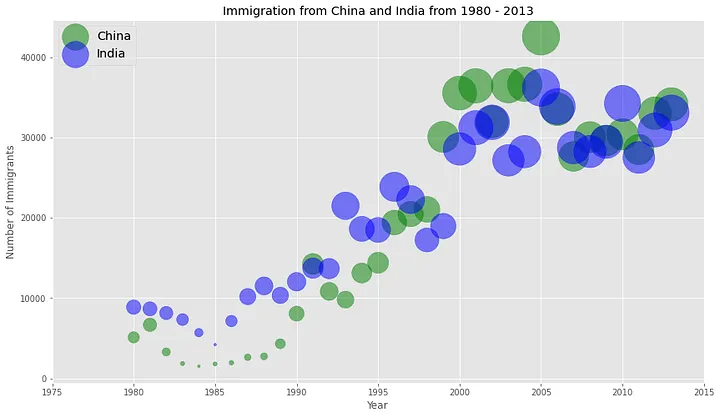
As for visualizing relationships between variables, go with a scatter plot or bubble chart for numerical data and a heat table for categorical data. A scatter plot displays data points to show the correlationof two numerical variables, while a bubble chart is similar to a scatter plot, in which the x- and y-axes consist of two numerical variables, but the bubbles (or circles) in it vary in size to encode a third numerical variable (see Figure 7).
Figure 7. A scatter plot (left) | Image Source: Medium | and a bubble chart (right) | Image Source: Medium
For categorical data, a heat table has one categorical variable placed in rows and another placed in columns. The cells of the table are then coded with numerical values, often by way of different intensities of color. This is a particularly useful way to identify patterns or relationships between categorical variables, such as countries and performance scores (see Figure 8).
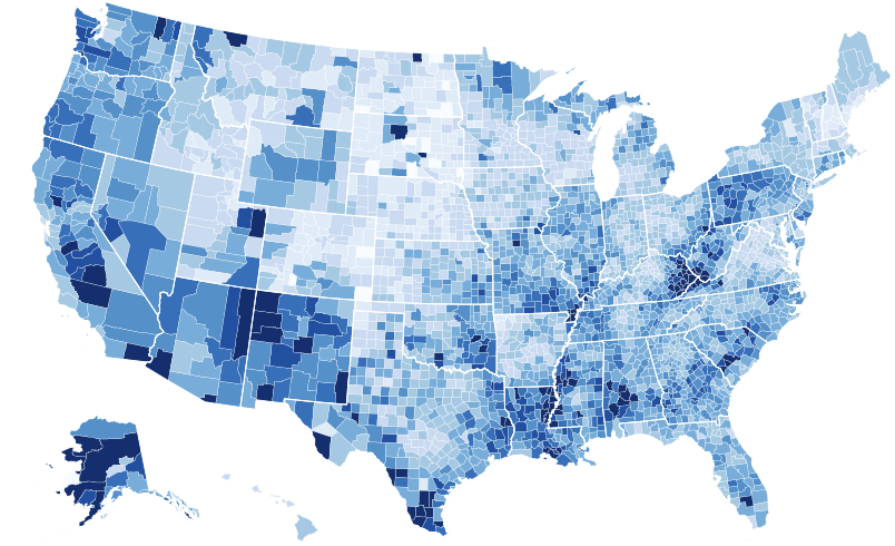
When you’re working with geospatial data, you might find a choropleth map more suitable (see Figure 9). It plots a numeric variable like population density over a geospatial variable such as regions or countries. This type of map illuminates the perception and realization of the spatial pattern by shading particular regions with differing tones.
The right chart for your data isn’t always immediately obvious. By establishing your purpose first, you narrow down your choices. You avoid overcomplicating or underrepresenting information. Another layer of factors to consider is the type of data you have and its size. And beneath all of these is your audience. From their familiarity with charts to the complexity of your data, decision-making always involves the people you are creating a chart for in the first place.
To learn more about data visualization, check out more articles here.
**********
Editor’s Note: This article was written in collaboration with Islam Salahuddin, data consultant at Systaems.
In the dynamic business landscape, strategic decision-making is the compass guiding organizations toward success. At the heart of this process lies data, the invaluable asset that fuels analytics and shapes the trajectory of strategic initiatives. However, the accuracy and reliability of data are the linchpins that determine the efficacy of these decisions. From this perspective, data governance plays a pivotal role in maintaining data integrity.
Data governance is a set of policies, processes, roles, and standards that ensure the effective and efficient use of data across an organization, in addition to compliance with relevant regulations and ethical principles. Data governance aims to establish clear rules and responsibilities for data creation, collection, storage, access, sharing, analysis, and reporting.
In that sense, a robust data governance strategy is indispensable in the context of strategic analytics. A data governance strategy is crucial for maintaining data accuracy and reliability and ensuring that the information driving decision-making processes is consistent, timely, and aligned with organizational goals.
assigning ownership of data assets and defining roles for data stewards, data analysts, and other stakeholders
implementing data quality KPIs and procedures to monitor and improve data accuracy and completeness
implementing robust data security measures to securely store and access data and to comply with data privacy regulations and ethics
investing in data management tools to automate data cleaning, profiling, and lineage tracking tasks
promoting a data-driven culture by educating employees on data governance policies and best practices
There are several examples of how the aforementioned measures help companies with their strategy management. One of these case studies is Wells Fargo, one of the largest banks in the United States. Wells Fargo adopted a data governance operating model, which defines the roles, responsibilities, and processes for the effective management of data across the organization. The company was better able to do this by connecting its data sources with a data fabric that integrates inputs from multiple systems.
In another case study, GE Aviation, the aviation division of General Electric, consolidated its scattered data sources in a data lake. A data lake is a large-scale data storage and processing platform that can handle structured and unstructured data from various sources, making information more manageable, reliable, and accessible for all users within the organization.
The two examples show that strategy management improved when built on accurate and reliable data, leading to better outcomes. Simply put, if the accuracy of the inputs is jeopardized, then the outputs can only be expected to be flawed.
**********
Editor’s Note: This article was originally published in the print edition of Performance Magazine Issue No. 29, 2024 – Strategy Management Edition


