How data visualization (mis)informs

Discussions on data visualization have rapidly increased over the last years as more executives, managers, analysts and basically everybody, wish for a better understanding of the raw data behind every day dashboards, scorecards or presidential poll results. The struggle is to bring the raw data to life in a simple and comprehensible manner.
Visualization is becoming vital for transmitting information in a non-verbal manner, but when done wrongly, it creates more confusion and ambiguity rather than provide desired answers. Visualization ideas, which at first might seem brilliant, can turn out to be puzzling for viewers, diminishing their willingness to look for answers due to the complexity or bad representation of the data.
An example of the most common mistakes in working with data visualization can be found in the article Data visualization – 5 DON’Ts.
Overcoming common mistakes when working with data visualization is not the only impediment. Taking into account the most important question, before conceiving any visual representation, “what is the story of the data”, this is a question that people can misinterpret, either willingly or unwillingly to display what the developer desires the audience to perceive.
One of the easiest ways to misrepresent data in a visual rendition is by messing with the y-axis on charts, rearranging elements such as bar graphs, line graphs, or scattered plots. In most cases, the y-axis should have a range starting from 0 to a maximum that encompasses the range of the data. Unfortunately, taken to an extreme, as in the example below, this technique can create a distorted view of the data making the differences between values appear much larger than they really are. The two graphs below present the same data from two different points of view. In the first case, it gives the impression that the interest rates have skyrocketed, while in the second case the difference is slightly observable. The difference between the lowest value and the highest value is 0.014%.
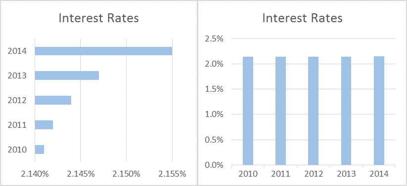
By displaying the data with a zero-baseline y-axis, the viewer has a more realistic picture of the facts, perceiving that the rates are almost static. Such examples are widely seen almost everywhere and the question on everyone’s mind is “Why start at 2.14%? Why not any other value?”.
Various people choose to create cumulative graphs to represent different types of data, such as: users on a website, revenue, downloads, sales or other important metrics. One very expressive example of data visualization that may create a disingenuous perception is from a chart presented by Tim Cook about iPhone sales.
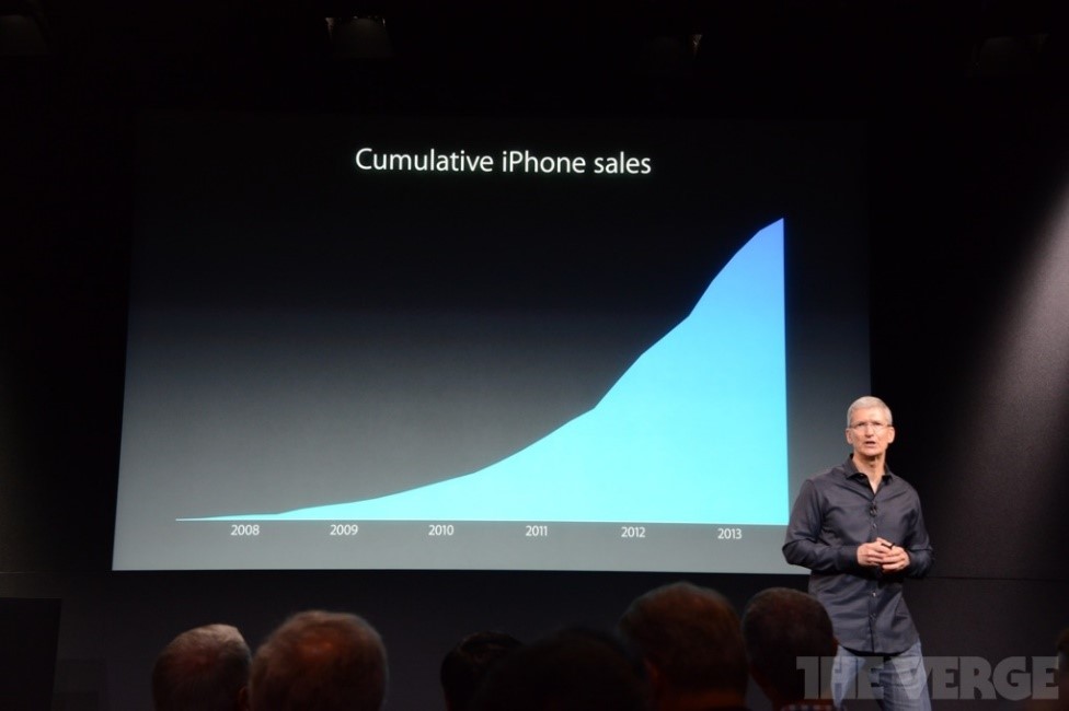
The visual in this example represents the sales of iPhone by Apple for a specific period of time. But the lack of an x-axis with a scale leaves the viewer guessing what are the highest and lowest values. Moreover, here is a clear example of data misrepresentation by using the cumulative technique. This method does not take into consideration the life span of a product and continues to add data from previous periods.
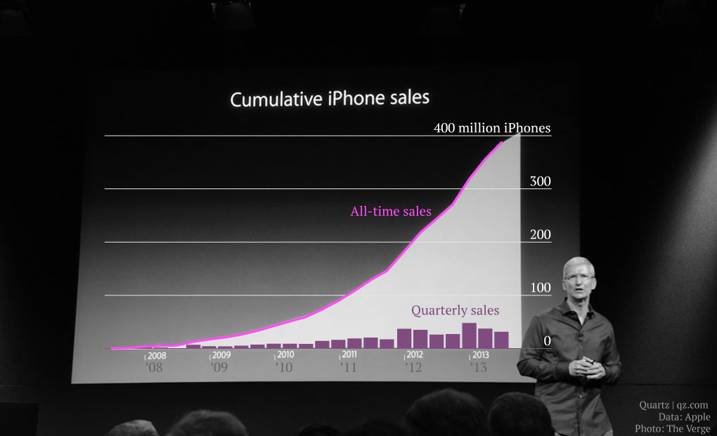
Taking a look at the real data, as highlighted in a recent Quartz article, it can be seen that although the cumulative sales are above 400 million iPhones sold, the quarterly sales paint a different picture. In the last year, on the graph, quarterly sales are actually decreasing and, following the trend set in previous quarters, it will probably continue to decrease.
Therefore, before creating any visualization and thinking of its design, one should consider some key aspects and try to answer some of the following questions:
- What story will the data tell?
- What questions should be visualization arise?
- Which data needs to be highlighted?
- What is the best architecture for revealing the most important aspects of the visual?
- Who are the viewers?
As one answers some of these questions, the right design and implementation process can begin. It does not mean that the visual aspect will not require any changes along the way, but taking the right route in the design phase will simplify the work and help create a better and more understandable representation.
Providing the user with a meaningful data visualization helps spread the message behind the vast data in the background across and assist the viewer in reaching a quicker, strategic and, most importantly, correct decision.
References:
- Tărâță, C. (2013), Data visualization – 5 DON’Ts, Performance magazine
- Levy, S. (n.d.), Telling Lies to Visualize
- Segel, E., Heer, J. (2010), Narrative Visualization: Telling Stories with Data
Image sources:
Tags: Data Visualization, Performance Management